ISTE Event Design
IXL’s 2022 booth kept educators in the aisle. I diagnosed why, then led the redesign of the conference environment across 2023 and 2024.
“A brand people could recognize from 50 feet away.”

IXL’s 2022 booth kept educators in the aisle. I diagnosed why, then led the redesign of the conference environment across 2023 and 2024.
“A brand people could recognize from 50 feet away.”
00 · Overview

At one of EdTech’s largest stages, ISTE, with 14,000–16,000+ attendees a year and 500 competing exhibitors, I led the entire visual system that helped IXL Learning build a presence and brand recognizable across a crowded floor, generate organic social content, and bring teachers back year after year.
IXL needed a 20×20 booth that could clearly express its brand, showcase its full product ecosystem, and create an inviting space for educators to explore and connect. My responsibility: deliver on a tight timeline, in close coordination with collaborating designers, contractors, and overseas fabrication vendors.
“A clear, confident space for personalized learning.”
The design goal
01 · The Challenge & Solution
The 2022 booth was functional. But three structural problems became the brief for the 2023–2024 redesign, and each had a direct design answer.
Tap a card to flip it, and reveal the 2022 photo behind each problem.


Execution constraints
Strict IXL brand guidelines, a two-week turnaround, coordination across 20+ large-format assets, and direct creative handoff to overseas fabrication vendors in multiple time zones.
02 · Research & Discovery

Reviewed how Microsoft Education, Brisk Teaching, PowerSchool, Google for Education, Renaissance, and Pearson used exhibit space to differentiate on the show floor.
Educators move fast, carry bags, stop briefly, and take photos. The strategy:
Studied construction documents, vendor specs, and SEG system requirements to anticipate constraints before design began, preventing costly downstream revisions.


Competitor exhibit references. Photos: Microsoft, Google, PowerSchool, Brisk Teaching, Tech & Learning / Ray Bendici.
03 · Design Process
Our design goal: the booth had to read clearly whether an attendee was 50 feet away or standing directly in front of a panel. We broke that into four steps, from first sketch to final fabrication.
Hand-drawn concepts to rapidly explore spatial configurations, keeping conversations on experience and flow, and giving marketing, events, and sales something tangible to react to before any production investment.


As the main design lead on this project, I built the comprehensive art-direction brief and visual mockup for the whole team, covering all 18 panel zones (G1–G18) with color codes. It defined the creative direction, messaging hierarchy, illustration style, and exact labeling for every surface, then assigned each zone so production could hand off cleanly to our overseas fabrication vendor.

This was a two-designer collaboration. Paulina and I split the 18 panels, with color-coded G1–G18 assignments keeping ownership legible between us. I led the art direction and owned the highest brand-exposure surfaces, while Paulina executed the angled canopy and side demo walls, all designed within one IXL brand system so the booth read as a single cohesive environment from every angle.
| Owner | Panels | What this covers |
|---|---|---|
| Ting (me) | G1–G8, G15–G16 (SEG towers), G18 (lightbox counter), Custom L-shape hanging sign | Main demo area, SEG towers, hanging sign, reception counter: the highest-visibility surfaces at every viewing distance. |
| Paulina | G9–G10 (canopy), G11–G14 (demo walls) | Angled canopy and side demo walls, executed within the visual system established through the brief. |
Designed within the vendor’s standardized graphic-area templates (dimensions, bleed, safe areas). Reviewed renders against the brief and annotated changes, with clear documentation at every step.


04 · The Solution
The booth was designed as a spatial experience that works at every stage of approach. As you step through the distances, each layer serves a distinct purpose in building brand recognition.
It plays through all three distances on its own, or click 50 ft, 30 ft, and 0 ft to explore how the booth reads as you approach.
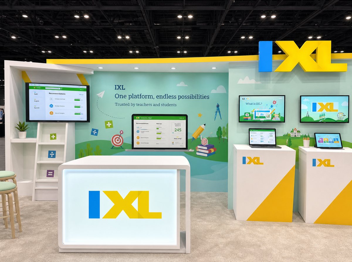
The redesigned booth, built to read across three viewing distances.
The core creative decision: move away from Shutterstock-heavy panels toward a custom illustration-driven language. IXL spans PreK–12 across four subjects, too broad for a single image, so the illustration system communicated “joyful, personalized learning” emotionally, while messaging and live screens handled product specifics. Each 2023–2024 decision directly addressed a 2022 failure mode.
Before · ISTE 2022
After · 2023–2024

Every IXL logo mounted high on suspended structures, impressive from a distance, invisible in any photo at human height.

IXL logos at eye level on the lightbox counter and background structures, so every casual photo captures the brand across multiple sightlines.

ISTE 2022 educator interviews were filmed against wood paneling, with no product logos, family branding, or illustration panels.

ISTE 2024 educator interviews leverage the newly designed family-product wall as a prominent, on-brand backdrop for video content.

Educators watched from the aisle, never crossing the threshold. The space felt like a shop window.

The demo zone was relocated to the center with inward seating, compelling attendees to enter and creating a consistently high-energy environment.
05 · Brand Touchpoints
The booth experience doesn’t end when attendees walk away. The swag suite was a deliberate extension of the booth’s brand system, each item chosen and designed with the marketing strategist and me for a strategic purpose, filtered by one question:
Would an educator actually use this swag item afterward?


Attendees leave carrying the booth’s brand system with them. The items most tied to the booth’s illustration system ran out fastest, and earlier each year: from end of Day 2 (2022) to mid-Day 1 (2023).
Imagine you’re standing on the busy conference floor. Experience the same instinct that cleared these counters faster every year, every item was chosen on purpose. Flip a card to reveal the spatial strategy behind it.
Click any of the cards to collect “all” your items!
06 · Impact & Metrics
ISTE Live is the largest EdTech conference in the U.S. With direct counters unavailable, booth impact is measured through proxy indicators.
| Metric | ISTE 2022 | ISTE 2023+ |
|---|---|---|
| Total attendance (official) | 14,282 | 16,000+ |
| Exhibitors competing | 444 | ~500 |
| Est. booth capture rate | ~13% | ~14% |
| Est. booth visitors | ~1,850 | ~2,250 |
| Swag depletion | End of Day 2 | Mid Day 1 |
| On-site video interviews | 8 | 15 |
| Sales: walk-in conversations | Higher than 2021 | Strongest year |
*Est. = estimated. Official attendance from post-conference reports; booth-level metrics are projections from observable signals and standard EdTech benchmarks.
07 · Result
The redesigned booth delivered measurably stronger results across both ISTE conferences it ran at. Backed by sales-team feedback, IXL’s booth stood out remarkably among a dense field of exhibitors, demonstrating that our design strategy executed flawlessly. The bright, consistent visuals and open layout transformed the booth into a welcoming, high-traffic destination.
Looking back at 2022: with crowds stuck at the perimeter, interviews filmed against blank walls, and disconnected swag, the value of this redesign is undeniable. It was never just a visual refresh; it was an architectural fix to real spatial and brand problems that unlocked the booth’s true commercial potential.

“The booth is amazing! I wish I could be there in person to check this out! I like all your products, I use them regularly at work. They are all so great!”
Susan Farago, Compliance Analyst & Children’s Education AdvocateFeatured in IXL’s official post-conference posts across LinkedIn and social media, generating strong engagement. Marketing, events, and sales cited the clarity of the visual messaging and the illustration-driven system as a meaningful improvement.


The clearest signal it worked at a deeper level: IXL used the booth as the backdrop for a series of educator interview videos published on YouTube across 2023–2024, with the G11/G14 family-product panels appearing directly in frame as a designed backdrop.


08 · Beyond ISTE
ISTE is the flagship, not the whole practice. Across my years at IXL I directed event and conference design for IXL and Rosetta Stone in the United States, United Kingdom, Germany, France, Australia, and Canada, spanning school marketing and enterprise sales, from a 20×30 show floor down to a single pop‑up banner.
| Region | Events | Brands |
|---|---|---|
| USUnited States | ISTE 2023 Philadelphia and 2024 Denver, IXL + Rosetta Stone for Schools 10×10, 20×30 and 10×20 booths, KSDE, AASA | IXL, Rosetta Stone for Schools, Vocabulary.com |
| USCalifornia, statewide | 30+ county Office of Education vendor fairs for the Takeoff state adoption | Takeoff by IXL |
| DEGermany | LearnTec Karlsruhe, Zukunft Personal Cologne | Rosetta Stone Enterprise |
| FRFrance | Paris enterprise booth | Rosetta Stone Enterprise |
| UKUnited Kingdom | World of Learning London, Enterprise conference stand | Rosetta Stone Enterprise |
| AUAustralia | EDUtech, the largest education conference in Australia, and the QASSP backdrop | IXL AU |
| CACanada | Conference pop‑up banner | IXL |
Most of this work lives inside internal systems and regional client environments, so it is described here rather than shown.
Three of these stands shipped before I kept a personal archive, and the original files did not come with me. The three below are AI‑generated reconstructions I built to show what each stand carried: the layout, the messaging hierarchy, the brand logic. They are diagrams of the design, not the delivered artwork. The surviving files follow below.
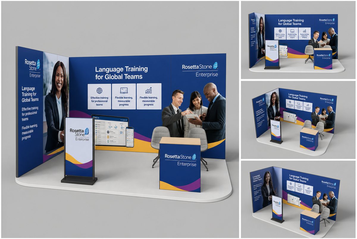
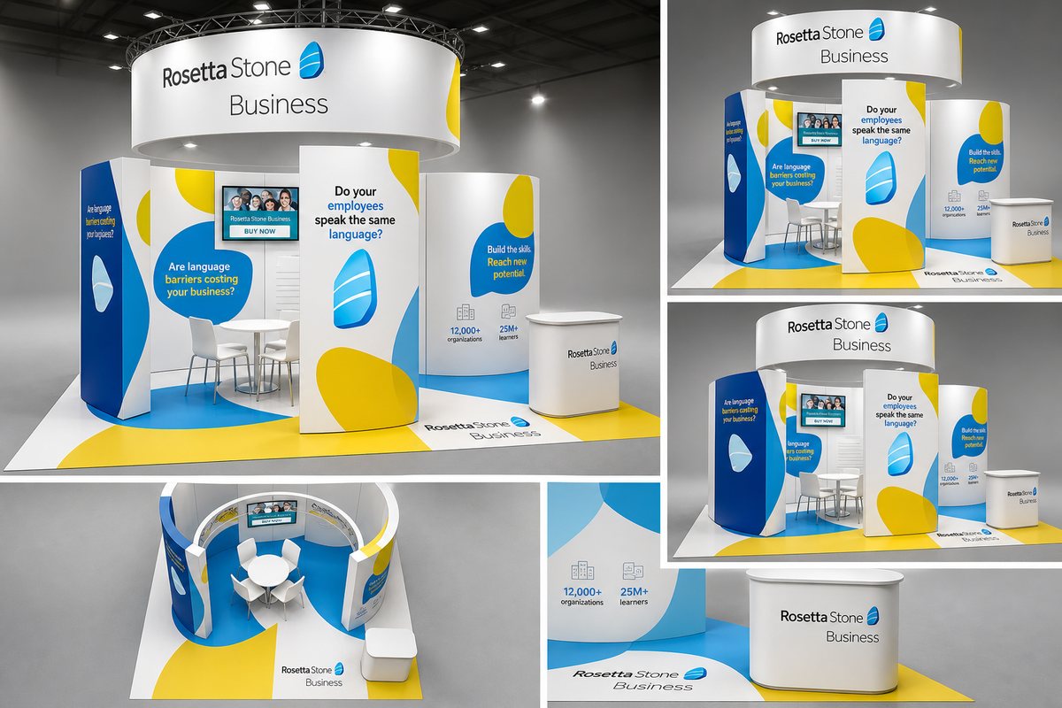
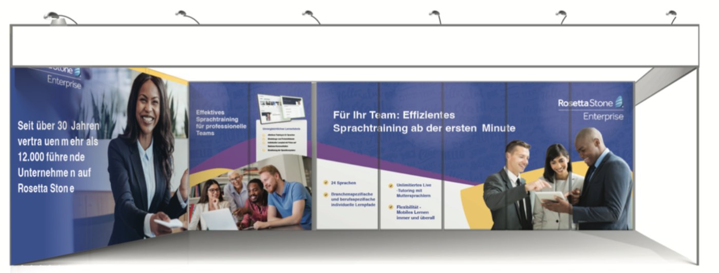
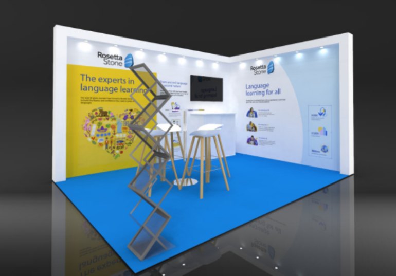
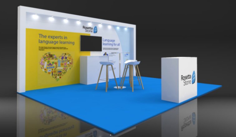
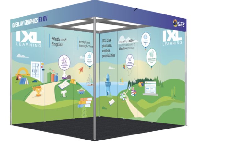
Stand structures are the fabricator’s modular systems, rendered back with my artwork applied. The brand graphics, layout, messaging hierarchy, and color are mine.
One designer cannot personally draw six countries of events. The model was ownership, not authorship.
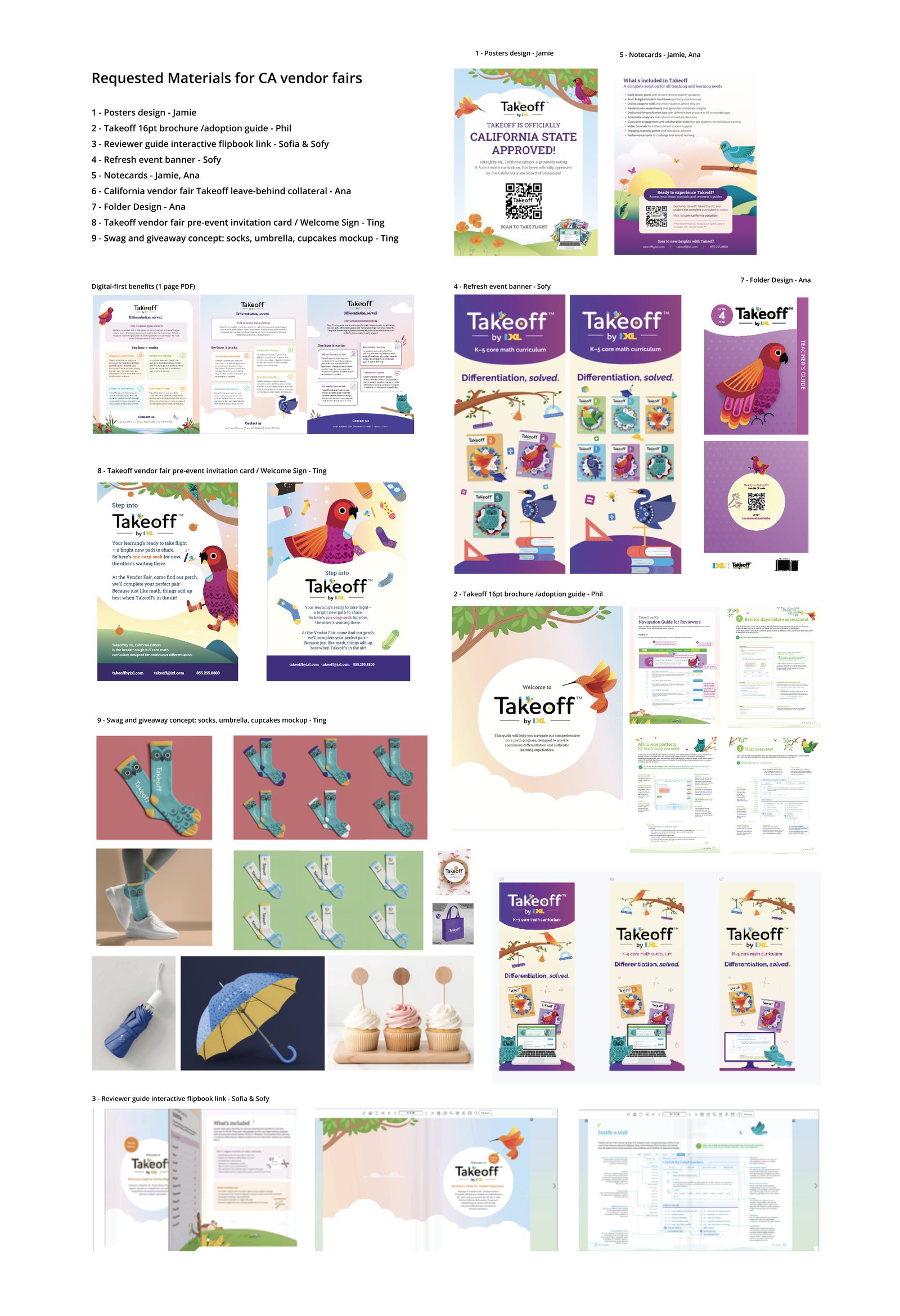
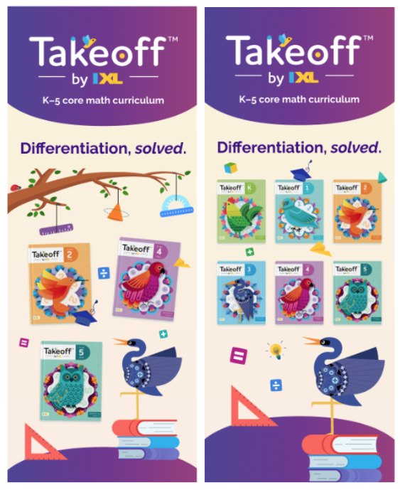
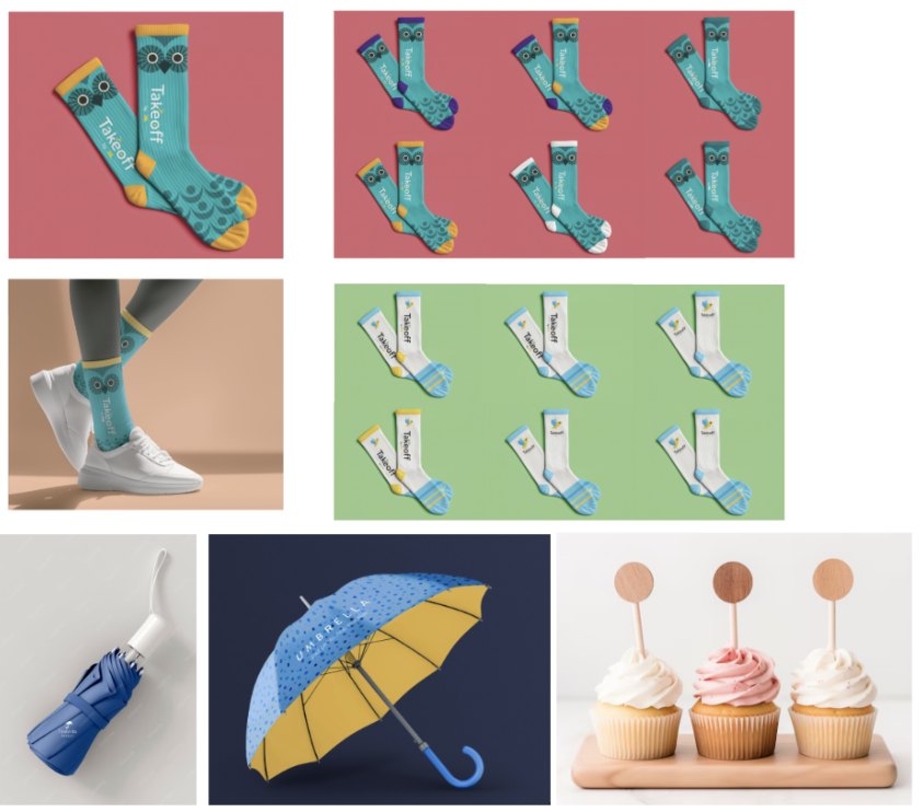
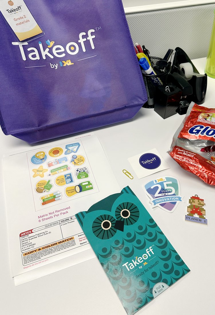
The clearest example is California. When Takeoff went through state adoption, the company needed a presence at the county Office of Education vendor fairs where districts actually evaluate curriculum. 30+ fairs, all supplied from one design program: posters, the 16pt adoption brochure, an interactive reviewer flipbook, event banners, notecards, folders, leave‑behind collateral. I kept the pre‑event invitation card and the swag concept myself.
The IXL and Rosetta Stone for Schools 10×10 asked a question a single‑brand booth never asks: how much of the space belongs to each brand. An even split read as indecision. We weighted it 70 IXL to 30 Rosetta Stone, then worked out how two logos share a surface without either one looking like a guest.
Even split
Weighted 70 / 30
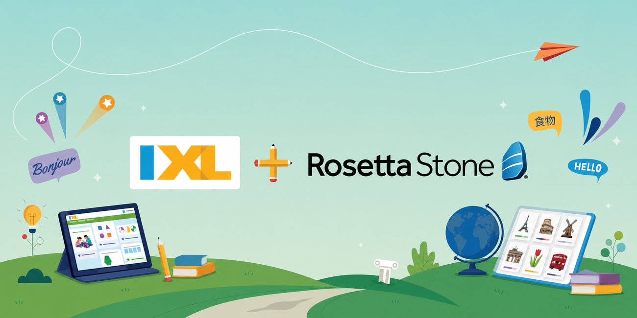
Both logos at equal size, side by side. Balanced, and unable to say which company you are standing in front of.
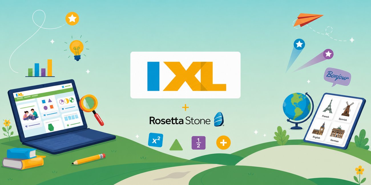
IXL leads, Rosetta Stone sits under it with the plus mark between. The hierarchy answers the question before anyone asks it.
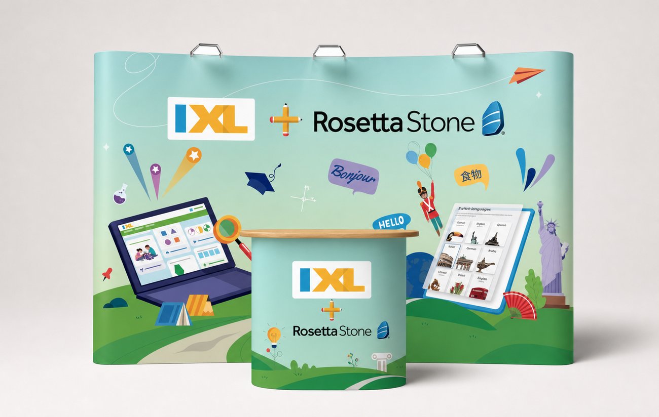
Across a curved wall the two marks compete at every viewing distance, and the landscape has to work around them.
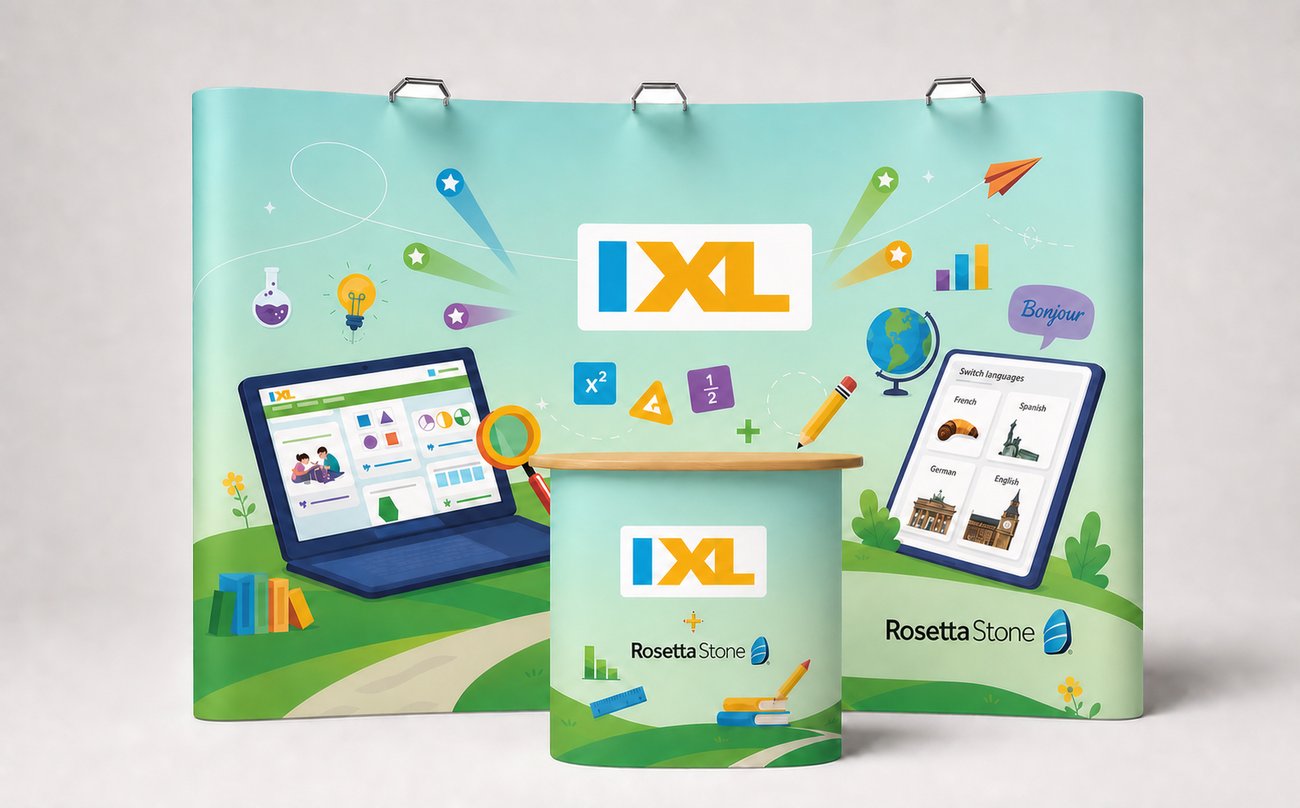
IXL holds the center, Rosetta Stone takes the right panel and the counter. One landscape runs under both, so neither logo has to fight for the surface.
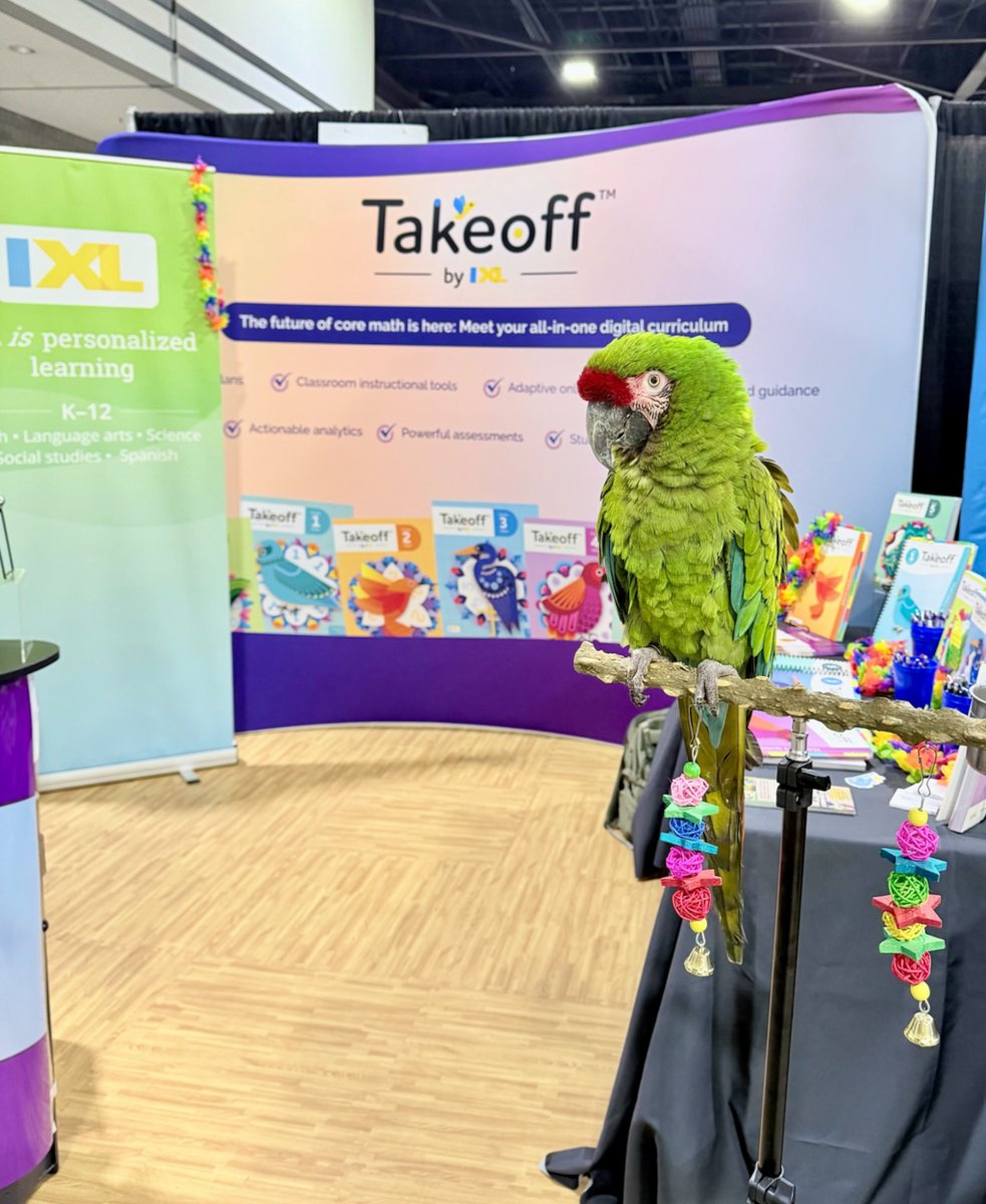
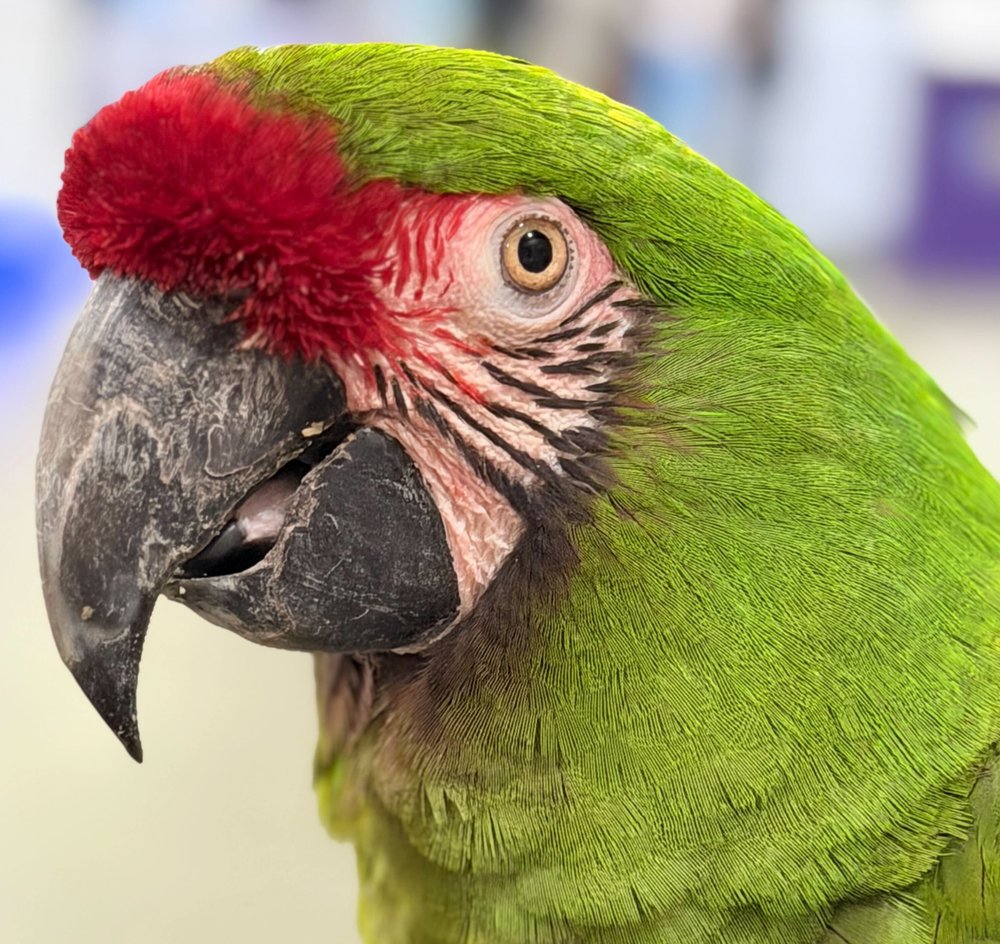
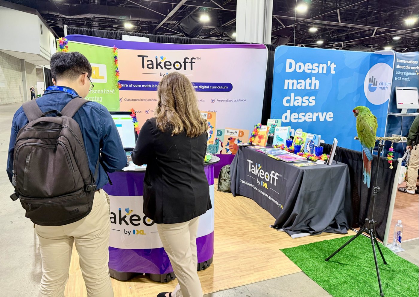
Takeoff’s whole visual system is birds. At a curriculum conference in Anaheim, marketing brought a live macaw and set it on a perch at the edge of the booth. Attendees stopped for the bird, then stayed for the demo. For one day the illustration was not a metaphor.
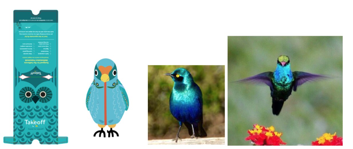
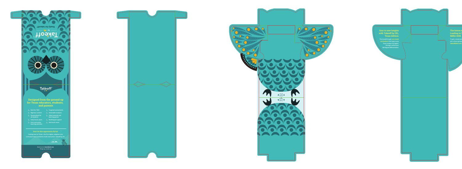
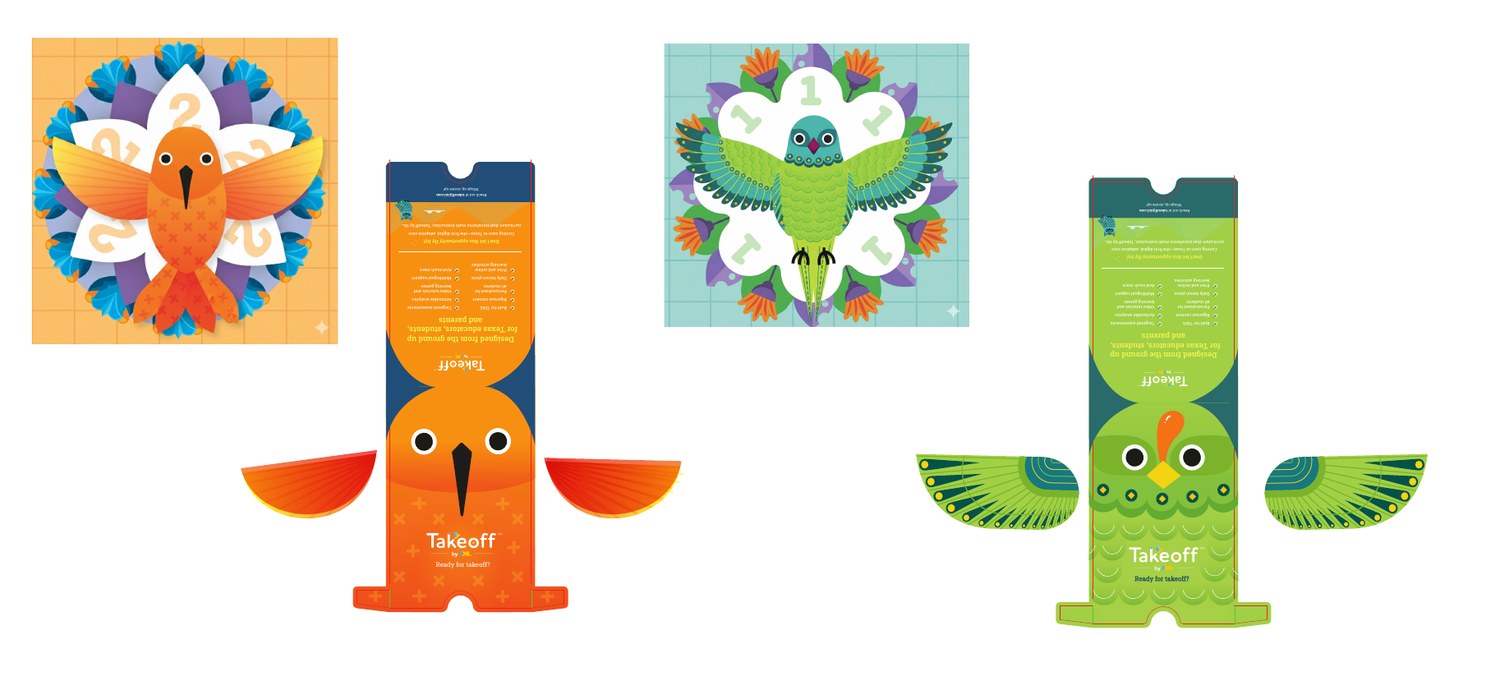
The Takeoff bird mailer ships flat and opens into a bird, wings pulling out from the body. That means the die line and the illustration are one drawing. Move a fold and you cut a wing in half. It ran in state editions, each one rebuilt against that state’s standards on the same die.
We took it through metallic ink and gold and silver foil sampling with the vendor, weighing each treatment against cost and shipping before committing. Special finishes look like a styling choice. They are a production decision with a budget attached.
Event work kept landing late. Vendor specs arrived weeks before a show, and the design team absorbed the gap as overtime. Treating each booth as an emergency was the real problem.
I proposed a quarterly design roadmap: collect annual plans from Curriculum, Marketing, and the Rosetta Stone and IXL conference teams, consolidate them into one view, and let the design team see the year before the year arrived. I also opened a retrospective with stakeholders on the tightest turnarounds, using the LearnTec booth as the case in point.
09 · Final Reflection
Across IXL’s flagship initiatives from 2022 to 2025, the medium kept changing and the mission never did. Takeoff asked for systemic logic across thousands of curriculum pages, built with a team I directed. Spark Studio asked for high-fidelity AI workflows for time-crunched teachers. The ISTE booth asked for a physical space that could stand out on a chaotic floor. Three different canvases, one job: solve a real problem in a way that moves the business.
The booth was never a detour from product thinking, it was the same craft in a new form. Print, pixels, or built space, the tools change, but my starting question stays the same: who is this for, what is standing in their way, and what does the company gain when I clear it?
On a floor that loud and that bright, the easy move is to design for the people already at the counter. When the demo washed out under the lights and the back rows couldn’t read it, the budget answer was a bigger screen. I solved it with a floor plan instead, pulling the seating into the center and out of the glare so the educator at the very back could still follow along. When the person at the edge can connect with what you built, everyone closer in already has.
