Brand Foundations
The color, type, and logo systems behind fourteen brands, and the governance that kept them true.
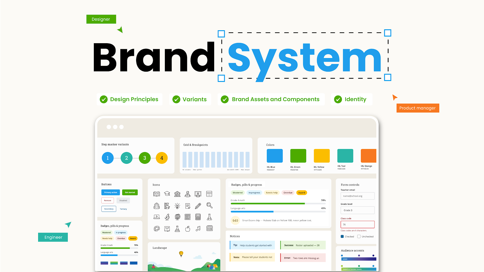
Live artifactOpen the IXL Brand System guide ↗
The color, type, and logo systems behind fourteen brands, and the governance that kept them true.
Live artifactOpen the IXL Brand System guide ↗
00 · The System
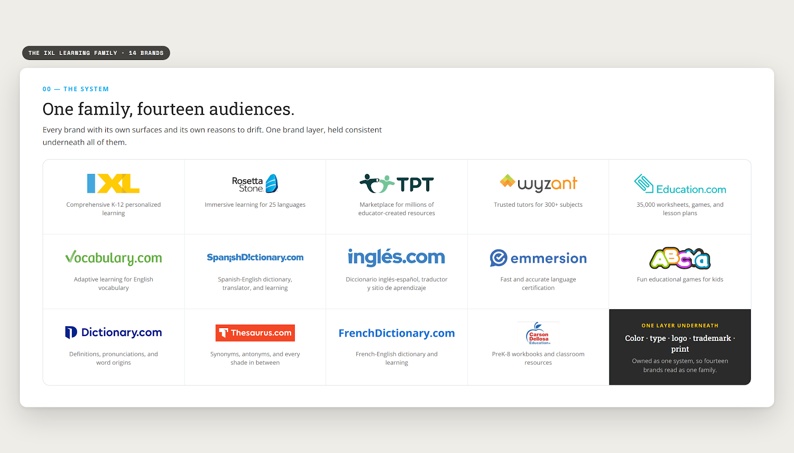
IXL Learning runs a family of brands: IXL, Takeoff, LevelUp, Rosetta Stone, Vocabulary.com and more. 14 brands, each with its own audience, its own surfaces, and its own reasons to drift.
Read it the atomic way: atoms (color and type), molecules (the logo lockups, the icons and illustration), organisms (the template catalog), and the ecosystem of ownership that keeps all of it alive.
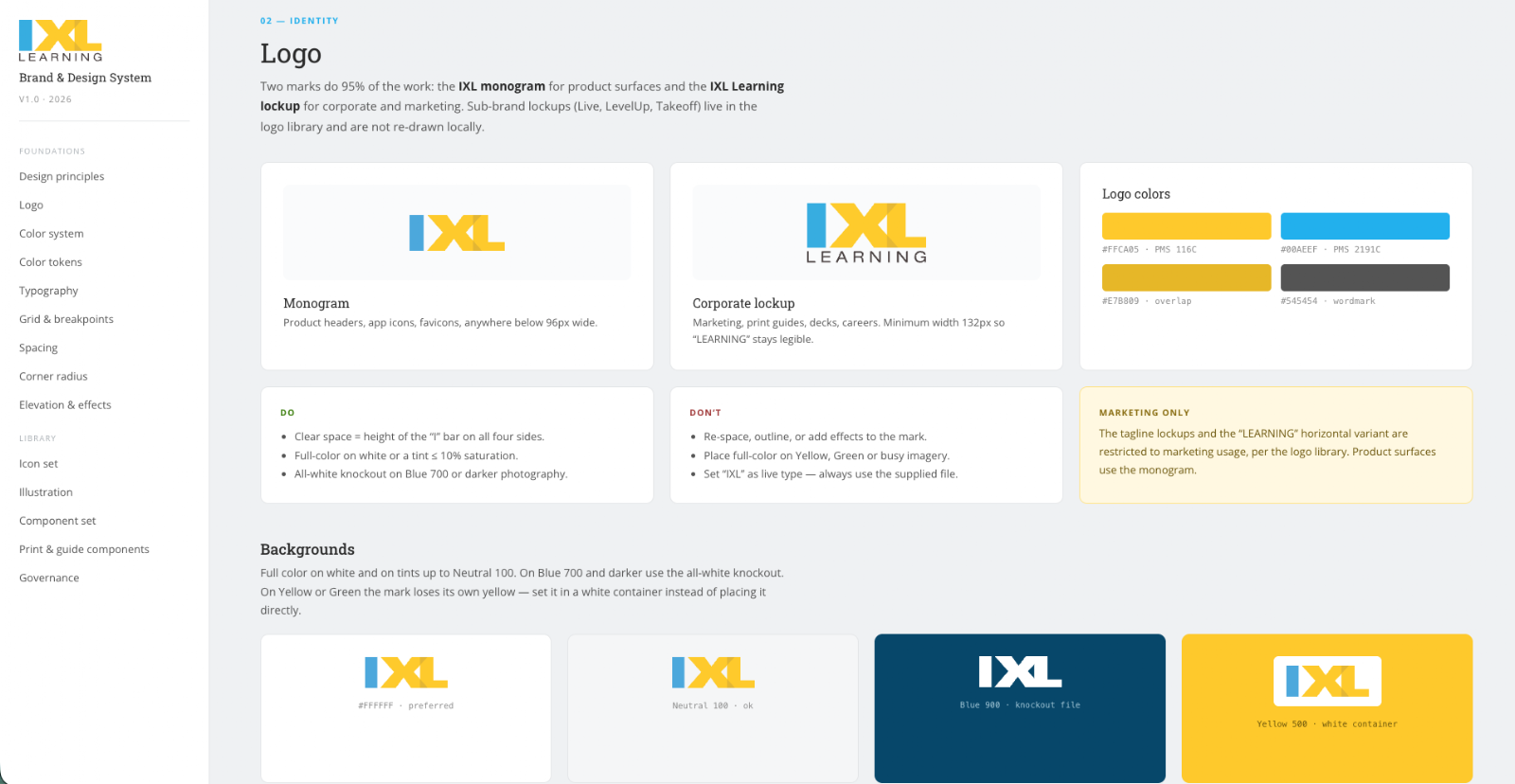
And this page has a companion: the system itself, rebuilt as a living brand guide, fourteen sections from principles to governance, set in the real Roboto Slab and Open Sans.
I owned the layer underneath all of them. As the owner of graphic and marketing design, I held brand consistency and quality control across every print and marketing project, and partnered with the designers on the digital side to keep the same look aligned on screen, so all 14 brands stay consistent as one family. Color standards, typography, logo and trademark systems, and the libraries every designer built from. Not the campaigns. The thing the campaigns stand on.
This page is about that layer, and about the part people forget: a standard nobody maintains is just a snapshot.
One note on scope. The chapters that follow walk the process through the IXL brand itself, the flagship, because it is the clearest way to show how the layer works. The other family brands ran on the same foundations and the same governance, but this study does not break them down brand by brand.
The brand layer is invisible when it works and expensive when it does not.
01 · Why It Exists
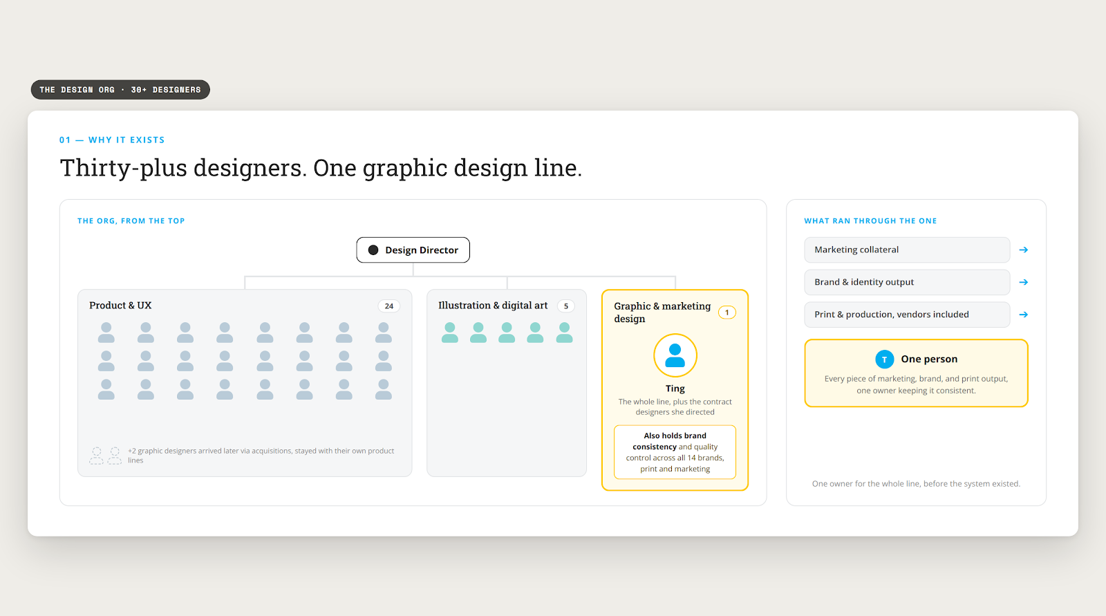
IXL’s design org was thirty-plus designers under one design director, almost all of them in product and UX, plus illustration and digital art. Graphic design was me. Two more graphic designers arrived later through acquisitions, but they stayed with their own product lines.
Owning the graphic and marketing design line was written into the role from the first week. What I inherited was not a system. It was a pile of folders, and every piece of marketing, brand, and print output ran through one person and the contract designers I directed.
So most days started the same way. The in-house team, our external vendors, and the contract designers all asked me a version of the same question, and I answered it one person at a time.
Work was assigned to whoever had capacity that day. With no template to start from, two designers given the same brief built it two different ways, and the versions multiplied from there.
There were two ways to handle that. Keep answering, or go upstream and remove the reason people were asking. I spent the next four years on the second one.
Three symptoms, one cause.
Templates lived in personal Drive folders, old tickets, and people’s heads. Version history was a conversation, not a system.
The same brand blue was one value on screen, another in a brochure, and a third on a 20 foot booth wall. Nobody had converted it on purpose.
Fourteen brands, several product lines, and no shared rule for sizing, clear space, or where the trademark symbol belongs.
Root cause
If a designer cannot find the correct file in thirty seconds, they will make a new one.
02 · Principles
Everything in this system falls out of four principles. They were never written as a poster; they were enforced as habits, which is why they held.
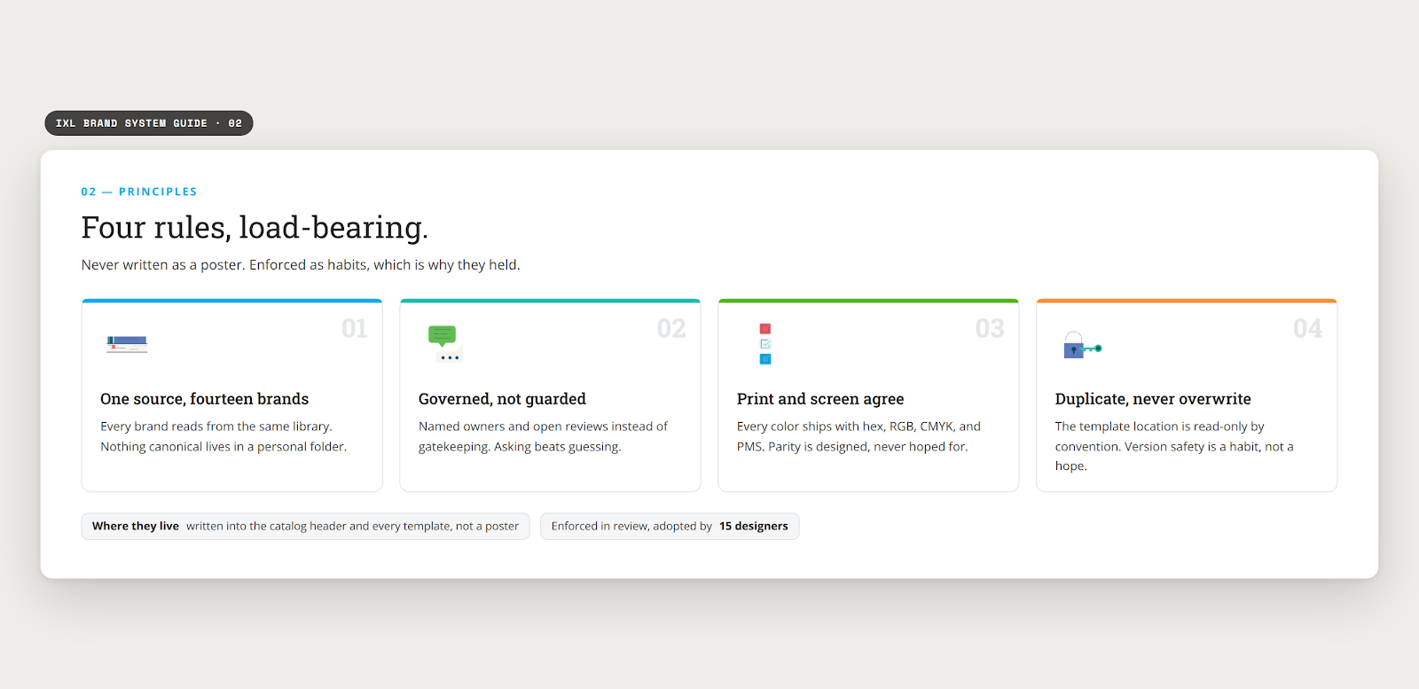
Every brand reads from the same library. Nothing canonical lives in a personal folder.
Named owners and open reviews instead of gatekeeping. Asking beats guessing.
Every color ships with hex, RGB, CMYK, and PMS. Parity is designed, never hoped for.
The template location is read-only by convention. Version safety is a habit, not a hope.
03 · Atoms · Color
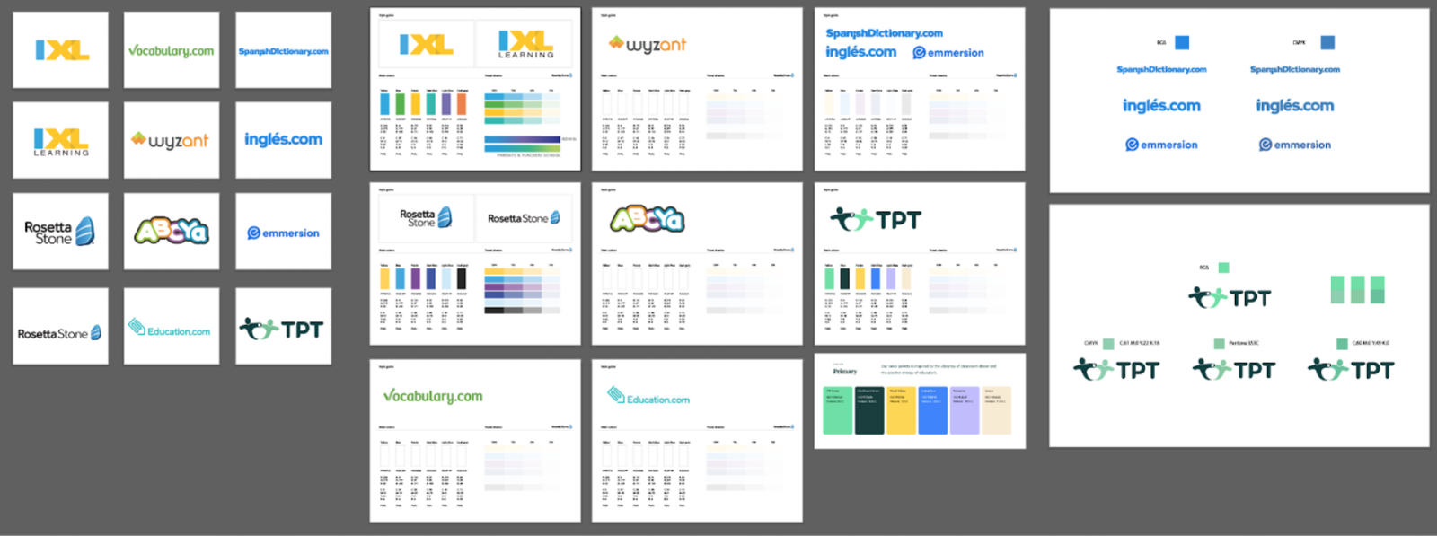
I built the color system as a file, not a document. CMYK color spaces went into the IXL Main Library and the Takeoff Library in Figma, with .ase swatch files attached, so any designer could pull the palette straight into Illustrator or InDesign instead of typing values by hand.
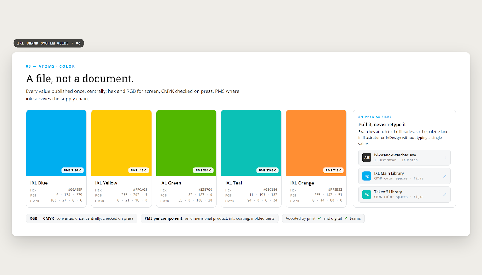
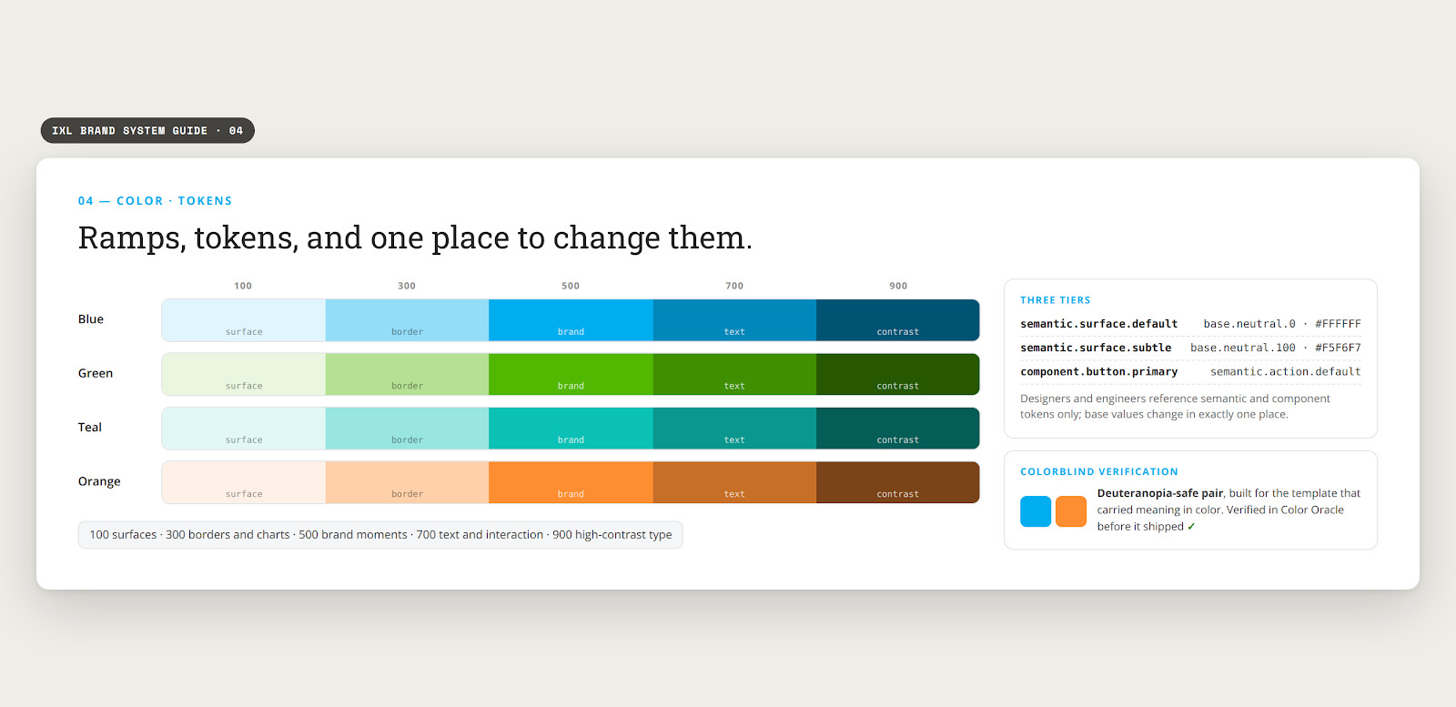
Brand color was defined in RGB. Large format output is CMYK. I converted the palette once, centrally, checked it on press, and published both values as one system rather than letting each vendor guess.
For anything with an ink, a coating, or a molded part, PMS is the only value that survives the supply chain. I bought the books, built an ink and paper sample library, and specified PMS per component on dimensional product.
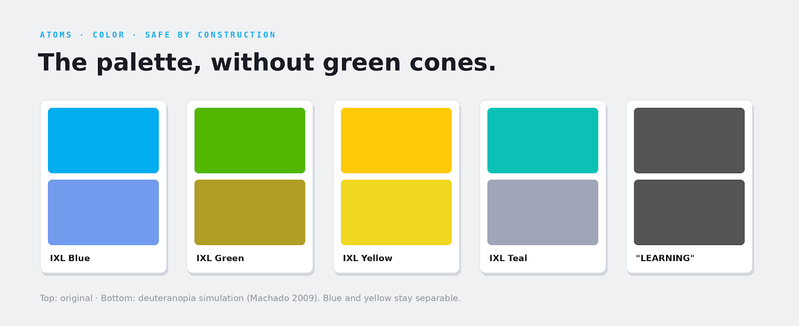
One template used color to carry meaning, which meant it failed for red-green colorblind students. I built a deuteranopia-safe pair and verified it in Color Oracle before it shipped.
04 · Atoms · Type
The core curriculum system moved off Open Sans. I ran the evaluation across Report, New Hero, Calibri, Museo Sans and Museo Slab, then migrated a system spanning thousands of pages without breaking the layouts already in production.
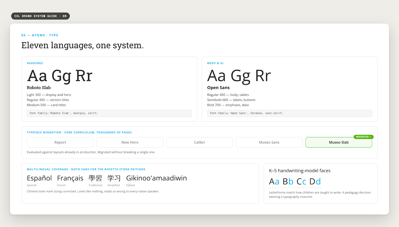
The brand shipped in Spanish, French, Chinese in both traditional and simplified forms, and Ojibwe. I moved the Rosetta Stone editions to Noto Sans for coverage, and corrected Chinese tone mark sizing, which looks like nothing and reads as wrong to every native speaker.
Kindergarten through grade 5 needed handwriting-model faces that match how children are taught to form letters. Choosing those is a pedagogy decision wearing a typography costume.
05 · Molecules · Logo
Logo usage had drifted across teams and surfaces, and each team held one piece of the problem. I brought those people into one room and we resolved it as a single problem instead of three.

The hard part was never the mark. It was deciding who gets to say no.
06 · Molecules · Visuals
Color and type make a brand recognizable. Illustration and icons make it feel drawn by one hand. This layer had the same disease as the rest of the system: assets scattered across decks, no shared rules, and every new project re-inventing the style from whatever it could find.
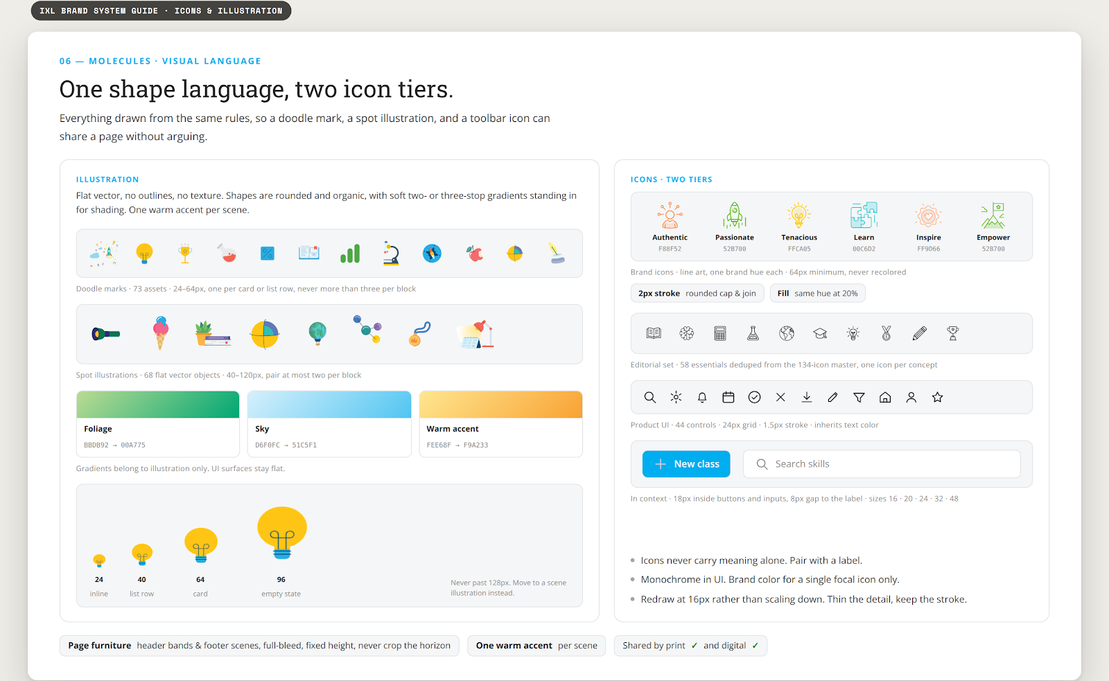
The illustration language is flat vector, no outlines, no texture. Shapes are rounded and organic, soft two- or three-stop gradients stand in for shading, and one warm accent keeps each scene from going cold. The master doodle sheet was split into 73 individual marks and the spot library holds 68 flat objects, so a designer places one asset at a set size instead of cropping a corner off a sheet.
Icons run in two tiers. Brand icons are line art in a single brand hue with a 20 percent fill of the same hue, for culture and careers surfaces. UI icons are monochrome on a 24px grid and inherit text color. The editorial set was deduped from a 134-icon master down to 58 essentials, one icon per concept, no near-twins.
The rules stay small and strict. Icons never carry meaning alone, they pair with a label. Gradients belong to illustration only, UI surfaces stay flat. And no spot mark scales past 128px, past that it becomes a scene.
07 · Organisms · The Catalog
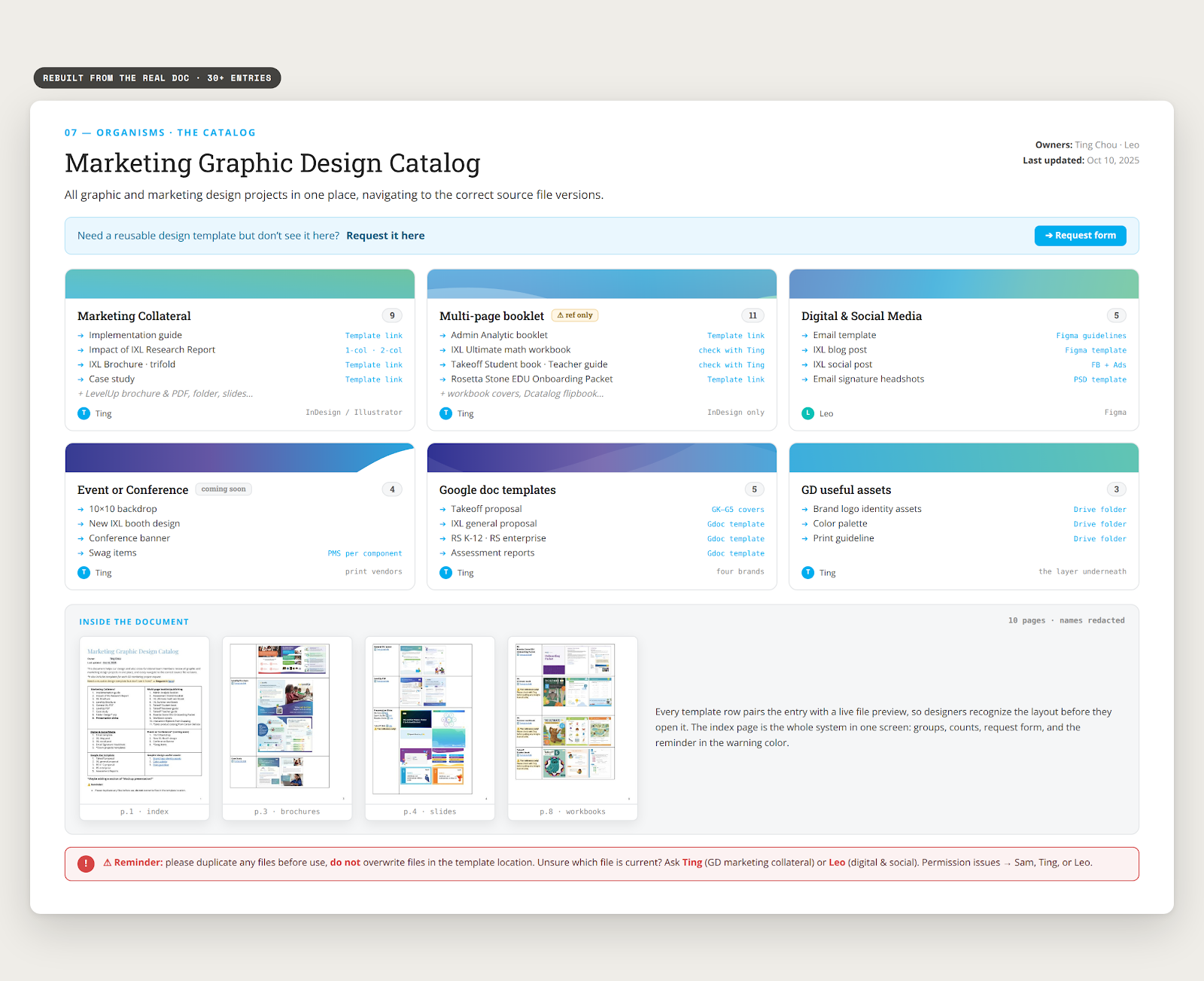
The catalog is the artifact the whole design org worked from. 30+ templates, organized by what someone is actually trying to make, not by which team happened to own the folder.
| Group | Count | Examples |
|---|---|---|
| Marketing collateral | 9 | Implementation guide, research report, brochures, case study, folder, slides |
| Multi-page publishing | 11 | Workbooks, student and teacher guides, analytics booklet, onboarding packet |
| Digital & social | 5 | Email template, blog post, social post, signature |
| Event & conference | 4 | Backdrop, booth design, conference banner, swag |
| Document templates | 5 | Proposals and assessment reports across four brands |
| Brand foundations | 3 | Logo identity assets, color palette, print guideline |
Every entry links to a file. No entry links to a person’s memory.
08 · The Ecosystem
The catalog works because it has rules, not just links. Three of them do most of the work.
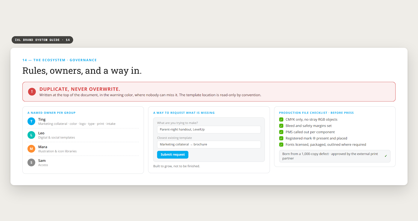
Written at the top of the document, in the warning color, where nobody can miss it. The template location is read only by convention.
Unsure which file is current? Ask a specific person, named in the document: Ting for marketing collateral, Leo for digital and social, Sam for access. A system with no name attached decays.
A request form for templates that do not exist yet. The catalog was built to grow, not to be finished.
Templates fix the output. Intake fixes what arrives.
I took over graphic design intake and reassignment, then defined the project types the queue actually contained, so a request arrives already knowing what kind of work it is and which template it starts from. The tools are part of the rules: print lives in InDesign and Illustrator, digital lives in Figma, booklets in InDesign only, written into the catalog itself.
A defect made it onto a 1,000 copy print run. I wrote a production file checklist and put it into the review round, before anything goes to press. It was later approved by our external print partner and adopted for their work with us.
A standard your team has to remember is a standard your team will forget. Put it where the work happens.
I built the Graphic Design Library, the template catalog, and the request intake. Then I did the part that decides whether a system survives: I put names other than mine on pieces of it.
I brought in the two managers whose designers were already touching graphic design work. Leo managed our digital and social contract designers, so those surfaces went to him. Mara’s reports handled illustration and icons, so that went to her. The brand layer underneath stayed with me.
| Area | Owner | Scope |
|---|---|---|
| Color standards | Ting | CMYK, Pantone, and .ase libraries. Print and screen parity |
| Logo & trademark | Ting | Print logo folder, sizing and clear space rules, registered mark usage |
| Typography | Ting | Typeface selection and migration, multilingual type |
| Print standards | Ting | Production file checklist, print guidelines |
| Request intake | Ting | Project types, assignment, and reassignment |
| Template catalog | Ting, with Leo | Ting: marketing collateral. Leo: digital and social |
| Illustration & icons | Mara | Asset library and usage guides |
Owning the boring layer is how you end up inside every other team’s project.
09 · In the Wild
| Before | After |
|---|---|
| Which brochure template is the right one? | Catalog entry, live link, source file |
| What is our blue in CMYK? | Published .ase, downloadable from the library |
| Can I use the logo at this size? | Sizing and clear space rules, in the folder with the files |
| Print defect found after the run | Checklist in the review round, before press |
| Templates in personal Drive folders | One location, one named owner per group |
None of these were design problems. All of them were costing design time.
Before, a brand or library update reached people one group at a time. I posted it separately to each team that needed it, then answered the same question again for whoever missed it. The system replaced that with one update to the core library and one announcement in a shared channel.
These are my own estimates, not a time study.
The point was never the time. It was that the answer stopped depending on whether I was online.
10 · Impact & Learnings
14
brands held to one standard
30+
templates governed
11
languages the type system covers
15
designers working from the libraries
Three things I would tell myself at the start.
The measure of a brand foundation is not how good the guidelines look. It is how rarely anyone has to open them.