One source of truth for the colors, type, spacing and components behind IXL product, marketing and print work — consolidated from the 2022 design libraries, the logo library and the implementation-guide asset sets.
7Hue families
4ptSpacing base
2Typefaces
12-colDesktop grid
01 — Foundations
Design principles
Five rules that settle arguments. When a token, layout or component choice is ambiguous, the principle higher on this list wins.
1
Clarity beats cleverness
A teacher scanning 32 student rows should never decode a visual. Plain labels, one idea per screen region, obvious next step.
2
Progress made visible
Green means growth. Every learning surface shows movement — a score, a streak, a level — before it shows a gap.
3
Accessible by default
4.5:1 on body text, 3:1 on UI edges, 44px minimum targets, never color alone. Yellow is a surface and an accent — not a text color.
4
One system, four audiences
Students, teachers, parents and admins share components; only accent, density and reading level shift. Never fork the system.
5
Friendly, not childish
Warm color and rounded corners carry the tone. Illustration stays flat and geometric so a K-2 screen and a district report still look related.
02 — Identity
Logo
Two marks do 95% of the work: the IXL monogram for product surfaces and the IXL Learning lockup for corporate and marketing. Sub-brand lockups (Live, LevelUp, Takeoff) live in the logo library and are not re-drawn locally.
Clear space = height of the “I” bar on all four sides.
Full-color on white or a tint ≤ 10% saturation.
All-white knockout on Blue 700 or darker photography.
Don’t
Re-space, outline, or add effects to the mark.
Place full-color on Yellow, Green or busy imagery.
Set “IXL” as live type — always use the supplied file.
Marketing only
The tagline lockups and the “LEARNING” horizontal variant are restricted to marketing usage, per the logo library. Product surfaces use the monogram.
Backgrounds
Full color on white and on tints up to Neutral 100. On Blue 700 and darker use the all-white knockout. On Yellow or Green the mark loses its own yellow — set it in a white container instead of placing it directly.
#FFFFFF · preferred
Neutral 100 · ok
Blue 900 · knockout file
Yellow 500 · white container
Product family
The IXL Learning family. In a family lineup all marks sit on one optical baseline at equal visual weight — match cap height, not bounding box — and all render one-color when shown together.
03 — Color
Color system
Four brand colors anchor the palette. Everything else is a ramp built off them: 100 for surfaces, 300 for borders and charts, 500 for brand moments, 700 for text and interaction, 900 for high-contrast type.
Brand colors
IXL Blue#00AEEFPrimary brand + interactive
IXL Green#52B700Progress, mastery, success
IXL Yellow#FFCA05Logo, awards, highlight fills
IXL Teal#0BC1B6Secondary accent, diagnostics
IXL Orange#FF8E33Listed as “IXL Yellow” in the 2022 sheet — reconcile before print
Library swatches
The 2022 design-library sheet reproduced as-is: four working primaries, their paired background tints, the two text neutrals and the softer icon hues. Everything below resolves into a ramp step or a token in the next sections — this page is the reference for matching legacy files.
Primary
Blue
#00AEEF
Green
#52B700
Purple
#7263AB
Orange
#F0803C
Background tints
Blue tint
#D6E9F8
Green tint
#D9EAD3
Purple tint
#E0DAEF
Orange tint
#FCE3D2
Text and rules
Body text
#454545
Footer
#CBCBCB
Page wash
#EAF6FC
Ink
#231F20
Icon and illustration hues
Illustration only — never UI surfaces, never text.
Coral
#F88F52
Peach
#FF9D66
Cyan
#00C6D2
Lime
#B0D35B
Sea green
#33B88C
Sky
#209DD8
Base ramps
Step 500 is the brand or library value sampled from the kit; 100/300/700/900 are the derived tints and shades. 700 and 900 are the only steps cleared for text on white.
100300500700900
Blue
E5F7FE
7FD7F7
00AEEF
0079A8
00466B
Green
EDF8E5
A8DB7F
52B700
3A8100
224C00
Yellow
FFF8E0
FFE482
FFCA05
E7B809
8A6E00
Teal
E3F9F7
79E0DA
0BC1B6
07877F
044D48
Purple
EEECF7
B5AFD8
766BB0
524A7C
2F2A47
Orange
FFF0E6
FFC699
FF8E33
C2611A
7A3A08
Red
FDECEB
F3A9A8
E65451
A33A38
612120
Neutral
F5F6F7
E4E6E8
CBCBCB
545454
2B2B2B
Audience accents
Carried over from the library: two three-stop gradients that signal who a surface belongs to. Use on hero bands, guide covers and section dividers — never behind body copy.
Roboto Slab for headings, Open Sans for everything else. Verdana is the legacy print/email fallback named in the kit — keep it in the stack, never as a first choice.
Headings
Roboto Slab
Light 300 — display and hero
Regular 400 — section titles
Medium 500 — card titles
font-family: 'Roboto Slab', Georgia, serif;
Body & UI
Open Sans
Regular 400 — body, tables
Semibold 600 — labels, buttons
Bold 700 — emphasis, data
font-family: 'Open Sans', Verdana, sans-serif;
TokenSpecimenSpec
displayEvery child can excel48/52 · 300 · -1%
h1Skill plan overview34/40 · 400
h2Diagnostic results26/32 · 400
h3Recommended skills20/26 · 500
body-lgStudents practice, IXL adapts, and teachers see exactly where to help next.17/28 · 400
bodyDefault paragraph size for product and print guides. Measure caps at 72 characters.15/25 · 400
labelGrade level13/18 · 600
eyebrowImplementation guide11/16 · 700 · +12%
captionData reflects the last 30 days of practice.12/18 · 400
06 — Layout
Grid & breakpoints
One fluid 12-column grid; column count drops at the two lower breakpoints. Max content width 1200px so tables stay scannable on classroom projectors.
Enter 180ms ease-out Exit 120ms ease-in Celebration 400ms cubic-bezier(.34,1.4,.64,1)
Overlay
rgba(28,45,58,.55) behind modals
10 — Library
Icon set
Two tiers. Brand icons are the supplied line-art set — 2px stroke, rounded caps, one brand hue per icon, with a 20%-opacity fill of the same hue for weight. UI icons are monochrome on a 24px grid and inherit text color.
Brand icons — values
Used on culture, careers and company pages. 64px minimum, never recolored outside their assigned hue.
Authentic
#F88F52
Passionate
#52B700
Tenacious
#FFCA05
Learn
#00C6D2
Inspire
#FF9D66
Empower
#52B700
Stroke 2px · rounded cap & joinFill same hue at 20% opacityCanvas ~64–96px, artwork bleeds to edge
Editorial icon set
58 essentials, deduped from the 134-icon master sheet — one icon per concept, no near-twins. All outline, no fills, uniform stroke, each normalized to the same square box so a row of them reads at one weight and one size.
{{ icon.id }}
Product UI icons
44 navigation and control icons, drawn to match the editorial set: 24px box, 1.5px stroke to sit at the same visual weight, round caps and joins, no fills. Shipped as SVG so the stroke takes the text color of whatever it sits in.
{{ ic.id }}
Semantic color
Default Neutral 700; status icons take the matching semantic text color. Never two colors in one icon.
Stroke stays 1.5px
Redraw at 16px rather than scaling down — thin the detail, keep the stroke.
In context
Search skills
18px inside buttons and inputs, 8px gap to the label.
Sizes
16 · 20 · 24 (default) · 32 · 48
Rules
Icons never carry meaning alone — pair with a label.
Monochrome in UI; brand color only for a single focal icon.
Optical alignment beats pixel centering at 16px.
11 — Library
Illustration
Flat vector, no outlines, no texture. Shapes are rounded and organic — rolling hills, cloud clusters, hot-air balloons — with soft two- or three-stop gradients standing in for shading. Figures are diverse, mid-detail, and always doing something: practicing at a laptop, reading, presenting. One warm accent per scene keeps the palette from going cold.
Sampled from the illustration masters. Gradients belong to illustration only — UI surfaces stay flat.
Scale & density
24 · inline
40 · list row
64 · card
96 · empty state
One mark per block below 64px. At 96px and above the mark becomes the focal point — drop the surrounding icon and give it its own row.
Never scale a spot mark past 128px; move to a scene illustration instead.
Spot illustration library
68 flat vector objects covering subjects, tools, science, wayfinding and reward moments. Every one is built from the same shape language — no outlines, no gradients inside the object, one highlight tone per fill. Place at 40–120px; pair at most two per block.
{{ illo.name }}
Doodle mark library
The master doodle sheet, split into 73 individual assets so each mark can be placed on its own. Use one per card or list row, sized 24–64px; never combine more than three in a single block.
{{ spot.name }}
Page furniture
Header bands and footer scenes are full-bleed and fixed-height — stretch horizontally, never vertically, and never crop the horizon. One band and one scene per page; pick the pair that matches the audience gradient.
Header bands
All bands are one height — 36pt in print, 48px on screen — and always run edge to edge. Never inset, never stacked.
{{ band.label }}{{ band.use }}
Footer scenes
{{ scene.label }}
Step markers
1
2
3
Chevrons run Blue 400 #209DD8 → Teal 500 #32BCAD → Purple 500 #7467AE and reset at step 4. Numerals are Roboto Slab Light in Blue 50, left-aligned in the flag body, never centered on the point.
Inline step dots
123
Circles are the compact form — use inside body copy and on screenshots; chevrons head a full step section.
Tip callout
Note and tip boxes use Blue 50 at radius 8, bold blue lead-in, and sit inline with the step they belong to — never in a margin.
Annotation callouts on screenshots use numbered circles in Blue 500, a 2px Blue 500 leader line, and Open Sans Semibold 13. Keep to four callouts per screenshot; use the chevron markers above for sequential instructions instead.
123
12 — Library
Component set
Every component is built from the tokens above — no local hex values, no one-off spacing.
Buttons
44px minimum height. Semibold 14. Radius 6. One primary per view.
Form controls
CheckedUncheckedRadio
Badges, pills & progress
MasteredIn progressNeeds helpOverdueAward
Grade 4 math78%
Language arts45%
640SmartScore chip — Roboto Slab on Yellow 100, never yellow text.
Notices
Tip:Help students get started with the LevelUp Assessment with this quick-start guide.
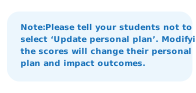
Note:Please tell your students not to select “Update personal plan.” Modifying the scores will change their personal plan and impact outcomes.
Success:Roster uploaded — 28 students added to Grade 4 Math.
Error:Two rows are missing an email address. Fix and re-upload.
Data table
48px rows, zebra on Neutral 100, numerals right-aligned and bold.
StudentSkillsTimeSmartScore
Ana Ruiz142h 10m92
Marcus Bell91h 32m71
Priya Nair173h 04m96
Devon Clarke40h 41m48
Product header
LearningDiagnosticAnalytics
64px tall · logo left · one active tab · avatar right
Footer rules and micro-legal use Neutral 500 (#CBCBCB) on Neutral 900, per the kit.
13 — Library
Print & guide components
The implementation guides, upload instructions and quick-starts share one kit: a color header band, numbered steps, and a rule-plus-logo footer. Three- and four-step variants only.
Implementation guide
Getting started with IXL
1Set up your class. Add students by roster upload or class code.
2Run the Diagnostic. 45 minutes of practice unlocks a full snapshot.
3Assign a skill plan. Personalized recommendations per student.
ixl.com/help · 1-855-255-6676
Step marker variants
Three steps by default; four when a verification step is required. Longer copy switches to the stacked layout.
1234
Header band options
All options share one thickness and run the full page width. Solid Blue for product and neutral docs; Admin gradient for district material; Parents & Teachers gradient for school-facing guides.
14 — Process
Governance
Adding to the system
Ship the one-off first, then promote it after the third use. Every promotion needs a token mapping, a light and dark surface test, and a print check.
Open items
Reconcile “IXL Yellow” #FF8E33 vs logo yellow #FFCA05.
Add the people-at-desk illustration set (currently only available as .ai/.psd source).
Export the UI icon library as a single SVG sprite.
Document sub-brand lockup clear space (Live, LevelUp, Takeoff).











 24 · inline
 1
 2
 3