Designing with Kids
One practice, two shipped products: drawing visual worlds for kids, then letting kids redraw them.
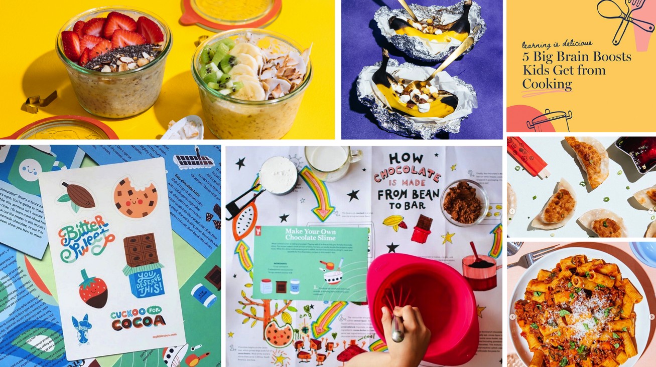
One practice, two shipped products: drawing visual worlds for kids, then letting kids redraw them.
00 · Overview
At KiwiCo I designed products whose entire job is to earn a kid’s attention with their hands, not a screen. This page follows one practice through two shipped products. Part 1 is Yummy Crate, a monthly cooking subscription: drawing its visual world, exploring it in dummies, and codifying it into a format a rotating team executes. Part 2 is the Armadillo Bowling Set, a plush game: specifying it for a vendor, then watching real kids take it apart in their living rooms. A closing chapter visits Atlas Crate, the world-exploration line I led, where the map itself is the interface. Draw the world, then let kids redraw it. That is the whole method.
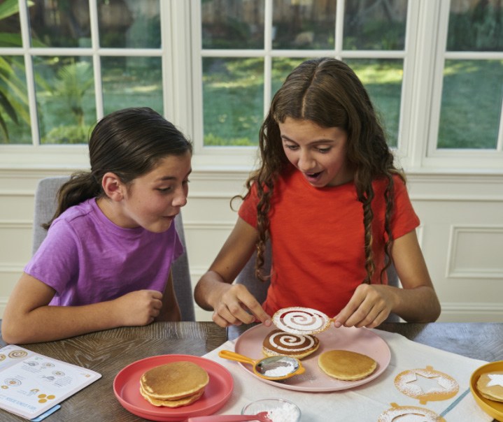
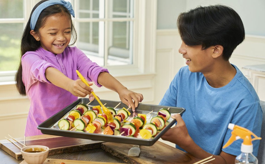
Yummy Crate is a KiwiCo subscription line that unlocks the science of cooking for kids. Every month a box arrives with 3 recipes, 2 STEAM activities, a kid-friendly magazine called the Yummy Zine, a grownup guide with a shopping list, stickers, and a specialty cooking tool. The line launched in October 2021 and became one of the company’s fastest-growing products.
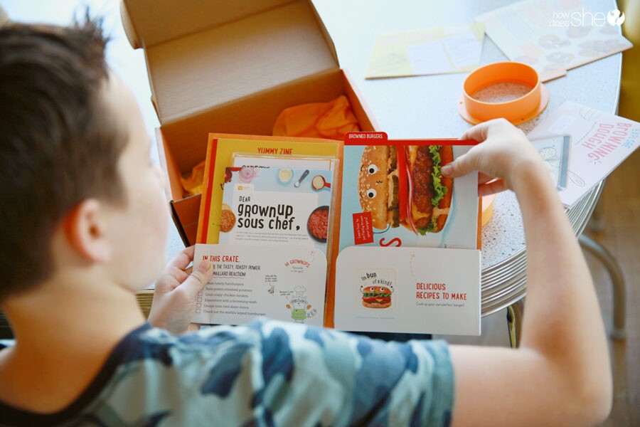
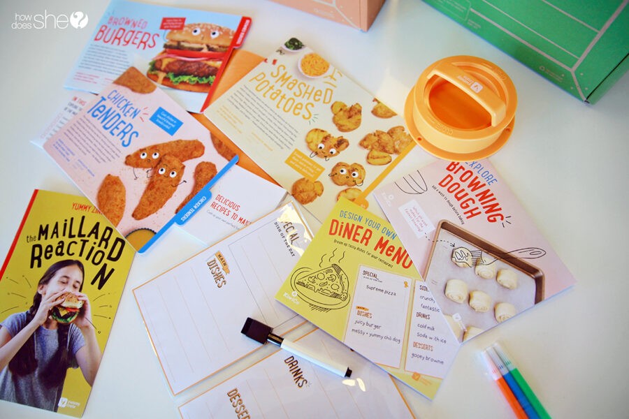
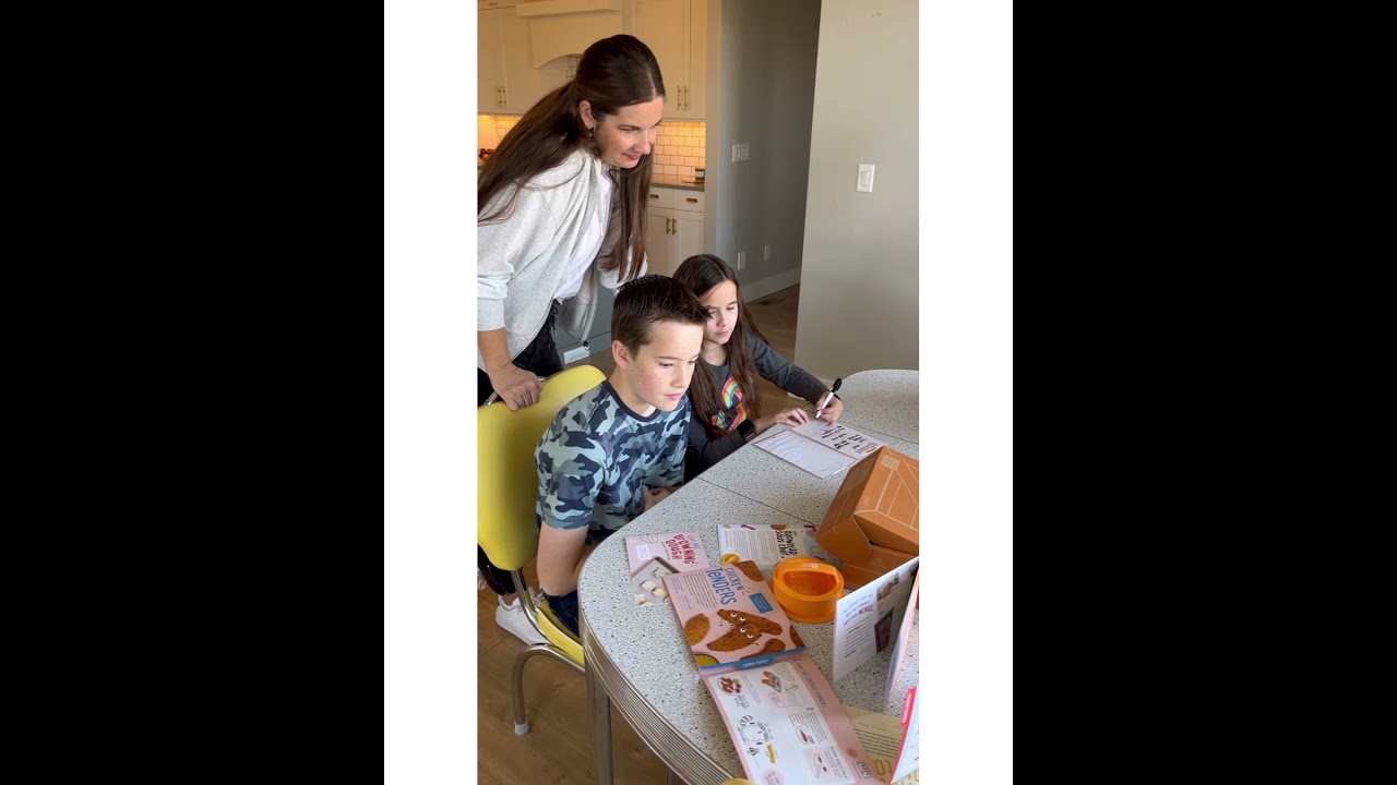
On both products I owned the graphic and component art and art directed the in-house photography, working alongside dedicated illustrators, editors, and product designers. The interesting design problem is never any single piece. It is the format: a monthly product needs a visual system strong enough that a rotating team can produce a new crate every month and every one still reads as Yummy Crate at a glance.
01 · The Brief
Our competitive research found that cooking kits for kids followed one pattern: the month-to-month collateral format never changed, and the physical product was almost always a generic kitchen tool. Nothing about the boxes said science, and little about them said play.
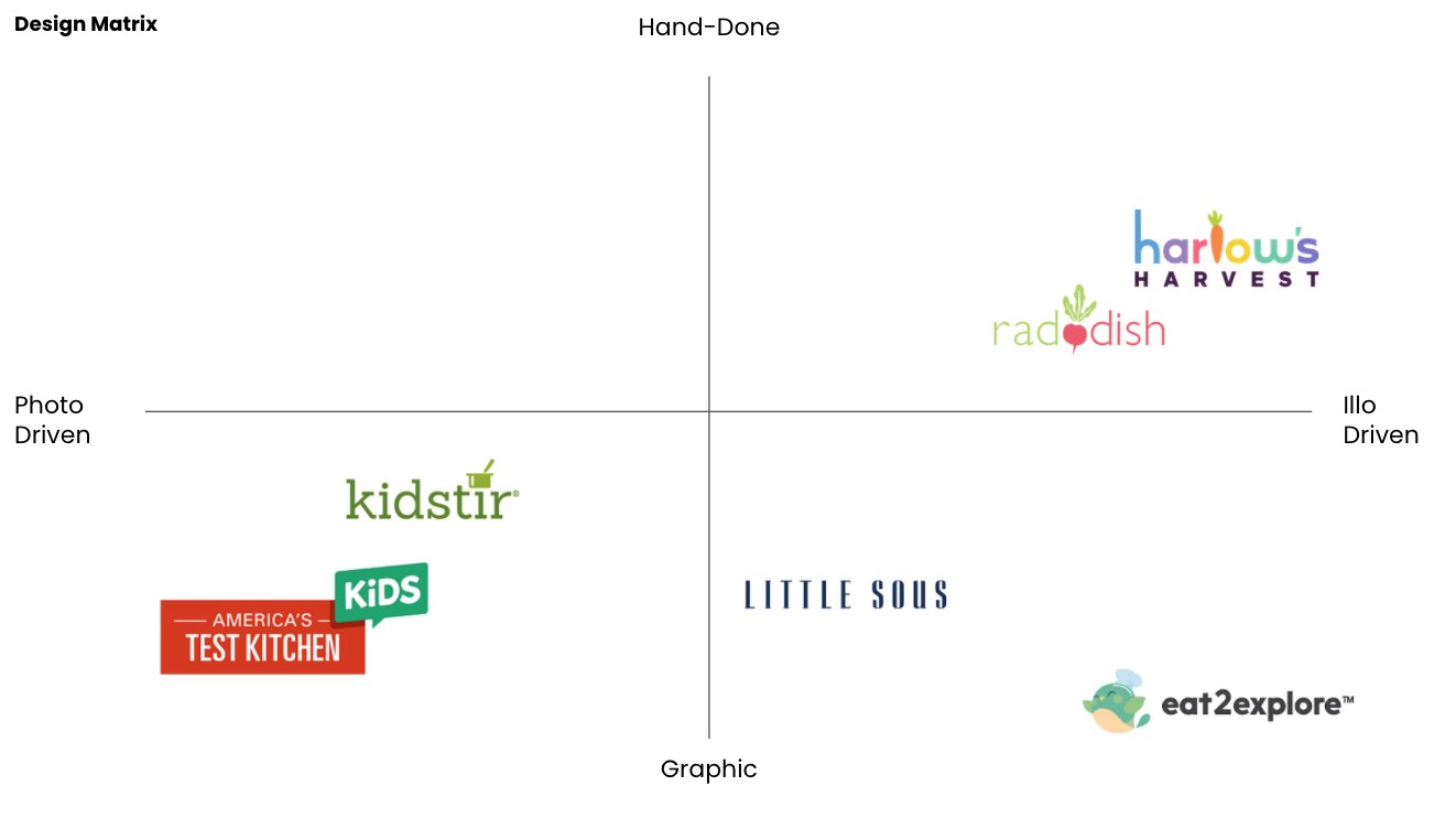
That sameness was the opening. The insight we designed from: science shows up in all aspects of life, even the kitchen. Browning a burger is the Maillard reaction. A color-changing drink is anthocyanin chemistry. The crate’s job was to make that visible, and the visual language had to carry the wonder without tipping into a classroom worksheet.
The strategy the team aligned on before any design work put it plainly: fuse food and science as a friendship, explain the why as much as the how, and treat cooking as a craft kids can own rather than a means to an end. Every visual decision after that had a test to pass.
02 · Visual World
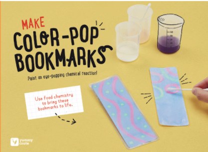
The voice of the line lives in three moves: real food photography kids can trust their dinner to, hand-lettered display type that sounds like a friend not a textbook, and character art on the food itself. A polenta pizza with googly eyes is funny to a seven-year-old and still appetizing to the parent doing the shopping. A hand-drawn doodle pattern of food and lettering carries the same voice out to the packaging and the launch campaign’s social graphics.
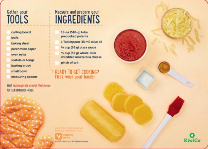
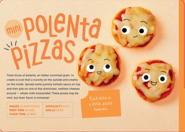
The hardest judgment in this territory is the line between joyful and juvenile. Yummy Crate serves a wide age band, so the system leans on wit rather than cuteness: puns on the sticker sheet, comic asides in the zine, characters that react to the science instead of decorating it. A six-year-old reads it as play. An eleven-year-old doesn’t read it as babyish.

03 · Explorations
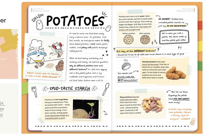
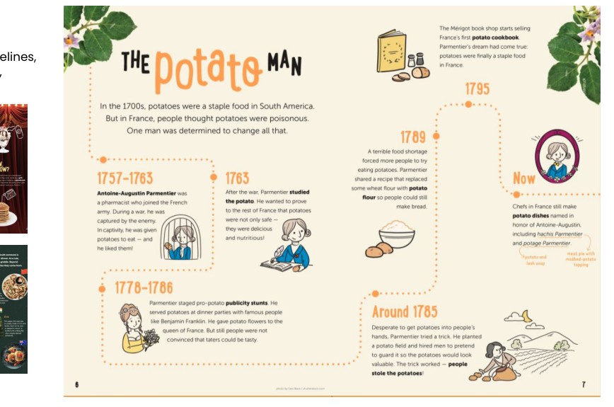
A visual world is not chosen from a mood board; it is drawn until it argues for itself. When the Yummy Zine moved toward its second format, the team built full dummy issues to pressure-test every decision in the artifact: cover art direction, hand-drawn typefaces, character voices, and how much science one spread can hold. The spreads below are working dummies, made to decide, not to print.
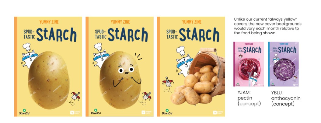
Three takes on one “Spud-Tastic Starch” cover, each giving the potato a different amount of stage. The bigger exploration sits beside them: instead of the line’s always-yellow covers, the background color would come from the month’s food, so a pectin issue turns jam-red and an anthocyanin issue turns cabbage-purple. One rule, endless variety, still one zine.
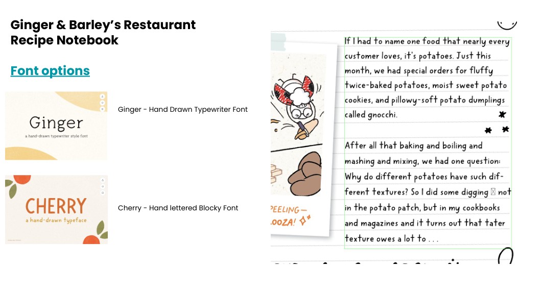
The zine’s margins are hosted by Ginger and Barley, two chef characters who annotate the pages in their own hand. That meant the typefaces had to feel like people: Ginger, a hand-drawn typewriter face for earnest notes, and Cherry, a hand-lettered blocky face for loud moments. A font choice here is a casting decision.
Explorations like these are where age-appropriate judgment actually happens. You cannot reason your way to the line between joyful and juvenile in the abstract; you draw both sides of it, put them next to each other, and the room decides in seconds. The winners were codified into the page map in the next section.
04 · The Kit
The monthly kit is a codified format. Each piece has a fixed job, a fixed structure, and a defined visual treatment, so a rotating bench of illustrators, photographers, and editors can produce a brand-new crate every month that still reads instantly as Yummy Crate. The format is the style guide, and the team executes against it.
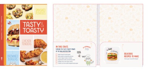
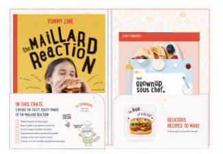
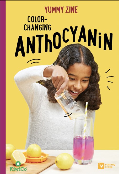
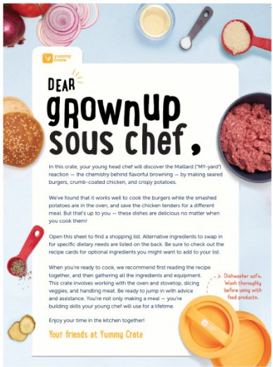
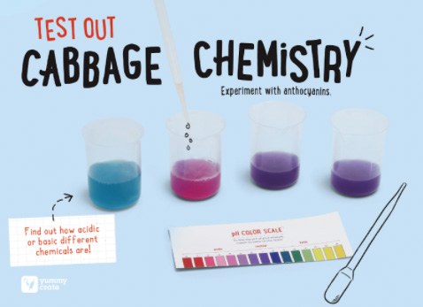
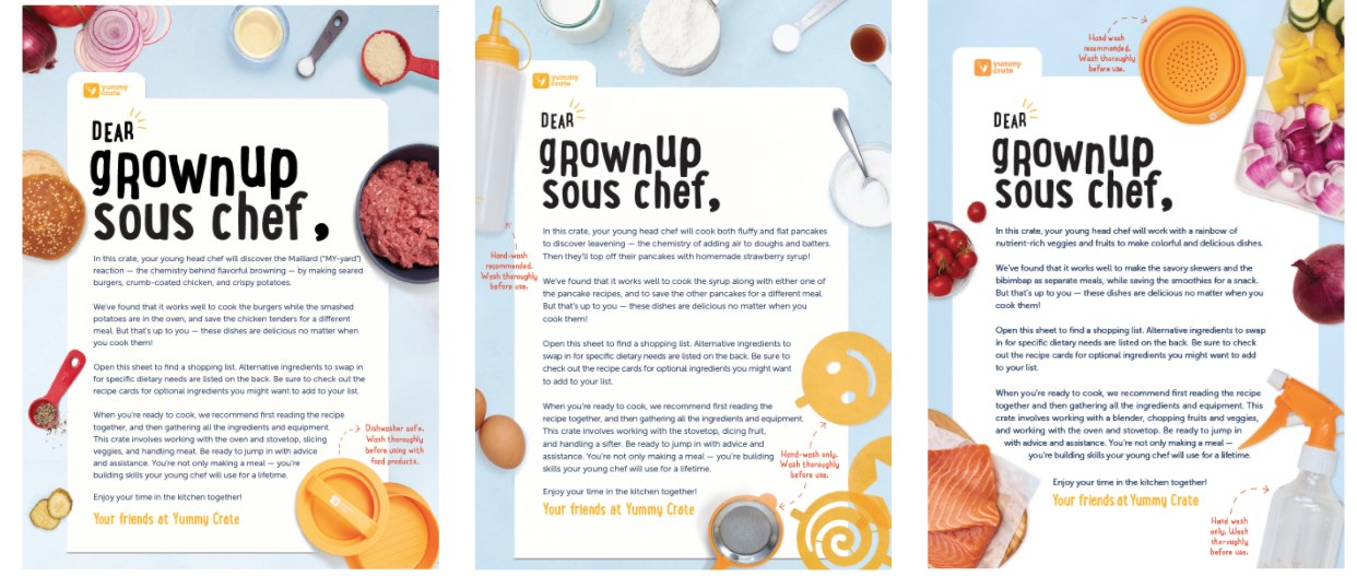
The clearest proof a format works is watching it repeat. The grownup letter below ran in three different crates: same structure, same voice, same layout, new food every time. When the frame holds this steady, a reader knows where they are before they read a word, and a new team member knows exactly what to produce.
The Yummy Zine got the same treatment. Its editorial format was codified into an eight-page map every issue follows:
A page map like this is a style guide for editors: it is what lets a format survive its makers.
05 · Direction
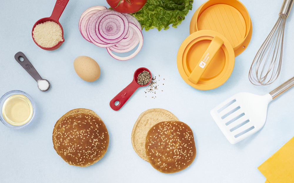
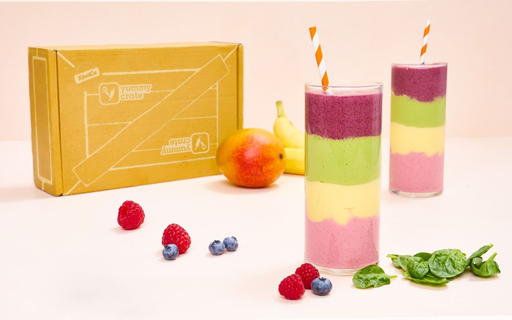
Two crafts on this line were not mine to draw, and directing them taught me more than drawing would have. The character illustration belonged to Carlianne Tipsey and Gracie Cole; my job was reviewing it against the line’s voice, where a note like “funnier, less cute” has to arrive with a reason and a reference. The photography was shot in-house; I art directed the shoots so every image carried the same warm daylight, real kitchens, and kids mid-action rather than posed.
06 · Kid Testing
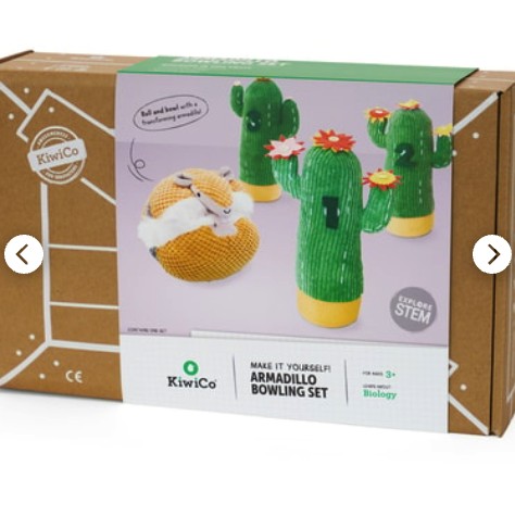
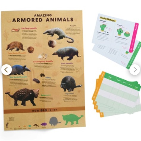
The Armadillo Bowling Set is a plush armadillo that rolls into a ball to knock down soft cactus pins, with felt numbers and flowers for math and pattern challenges. I drew the component art and vendor spec, and KiwiCo tests every product with real kids before it ships, so I also got to watch kids take it apart.
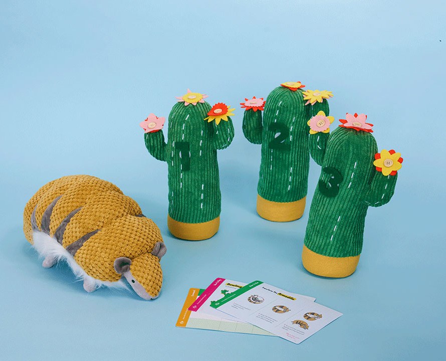
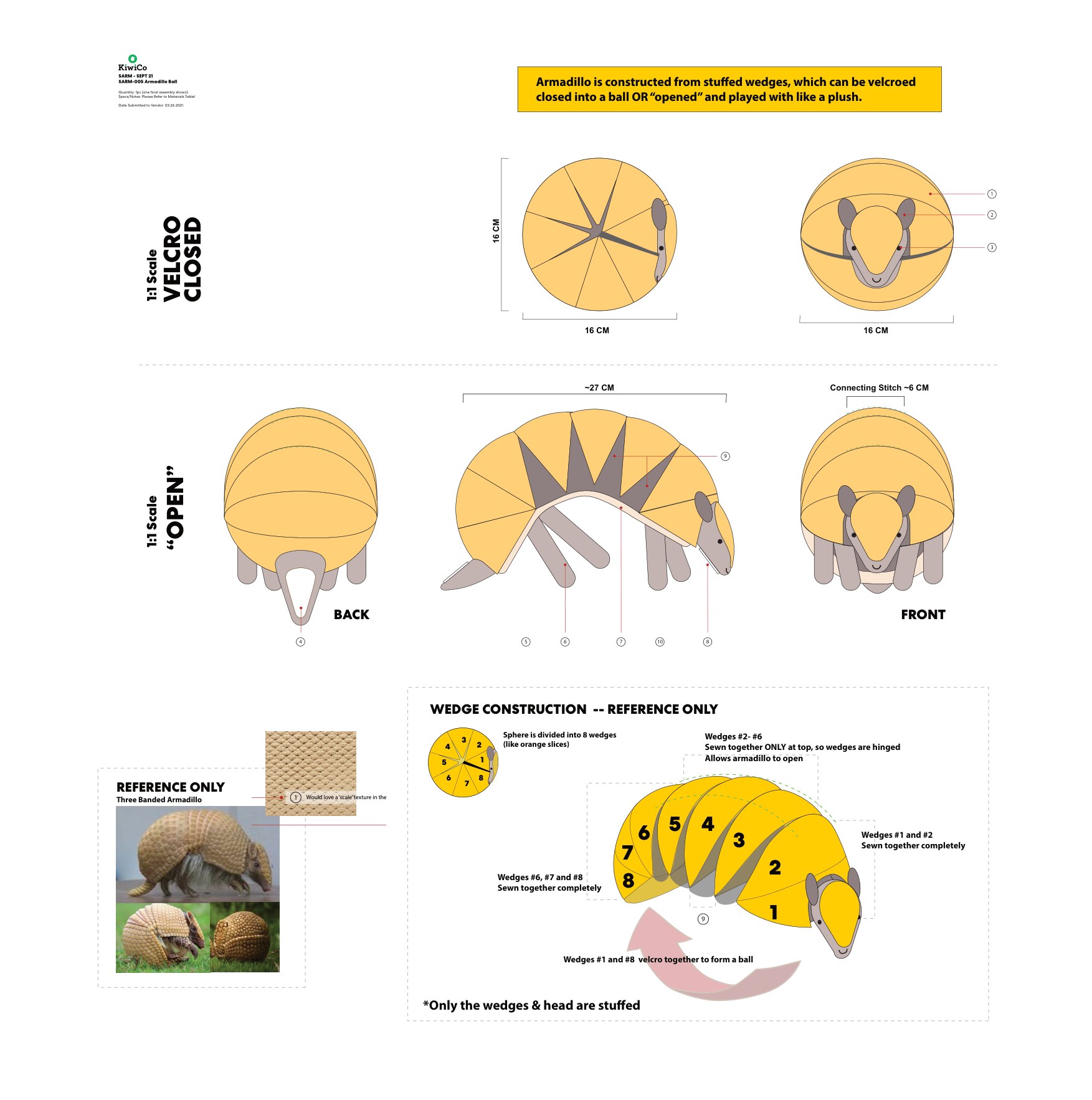
A plush toy ships as a drawing first. The construction problem, how a soft armadillo could roll closed into a ball, was solved at the lunch table: the body could be built from rounded wedges like orange segments, hinged at the top, velcroed at the ends. The spec sheet turns that idea into something a factory can sew: 1:1 scale views, stitch callouts, and a wedge-by-wedge construction diagram.
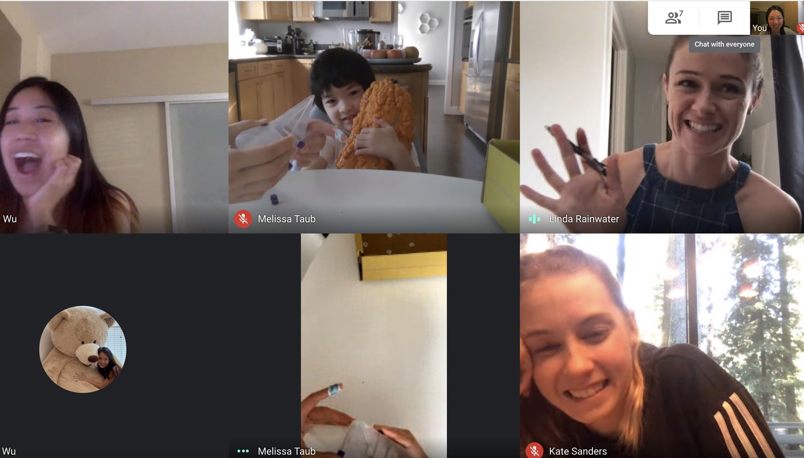
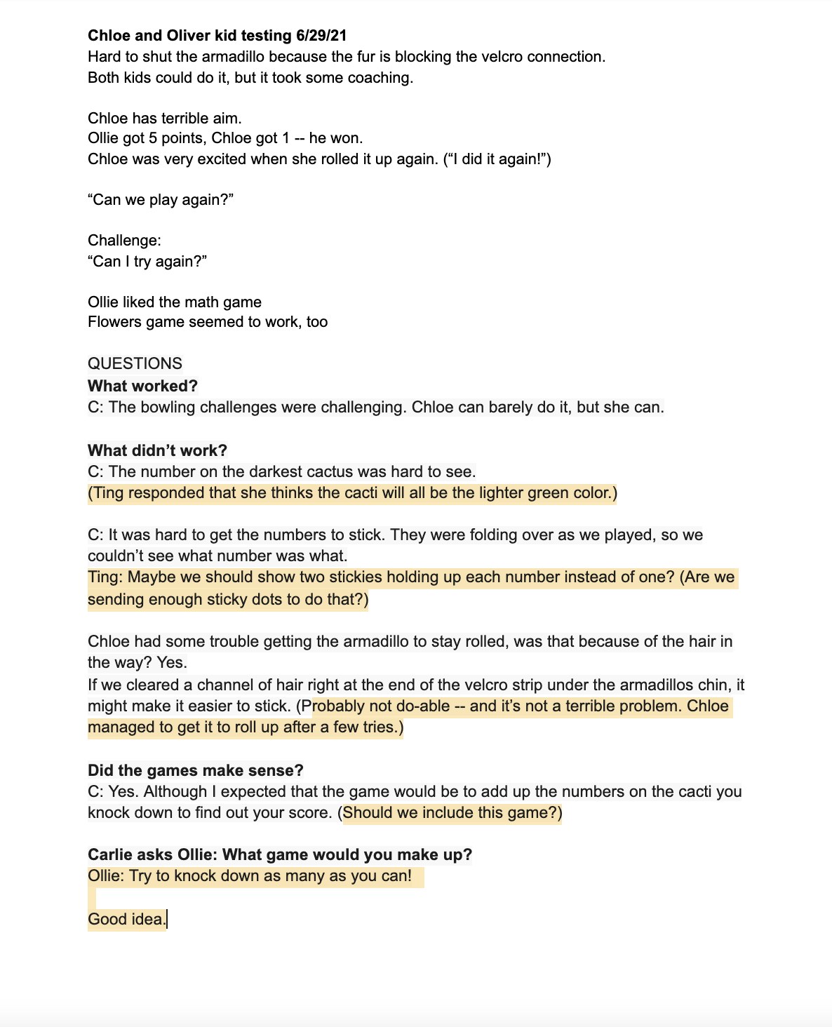
Testing ran through COVID, so it happened over video calls and in testers’ own living rooms. We watched for three things: problems in the design, opportunities to improve it, and how kids actually behave with the thing, which is never how adults predict.
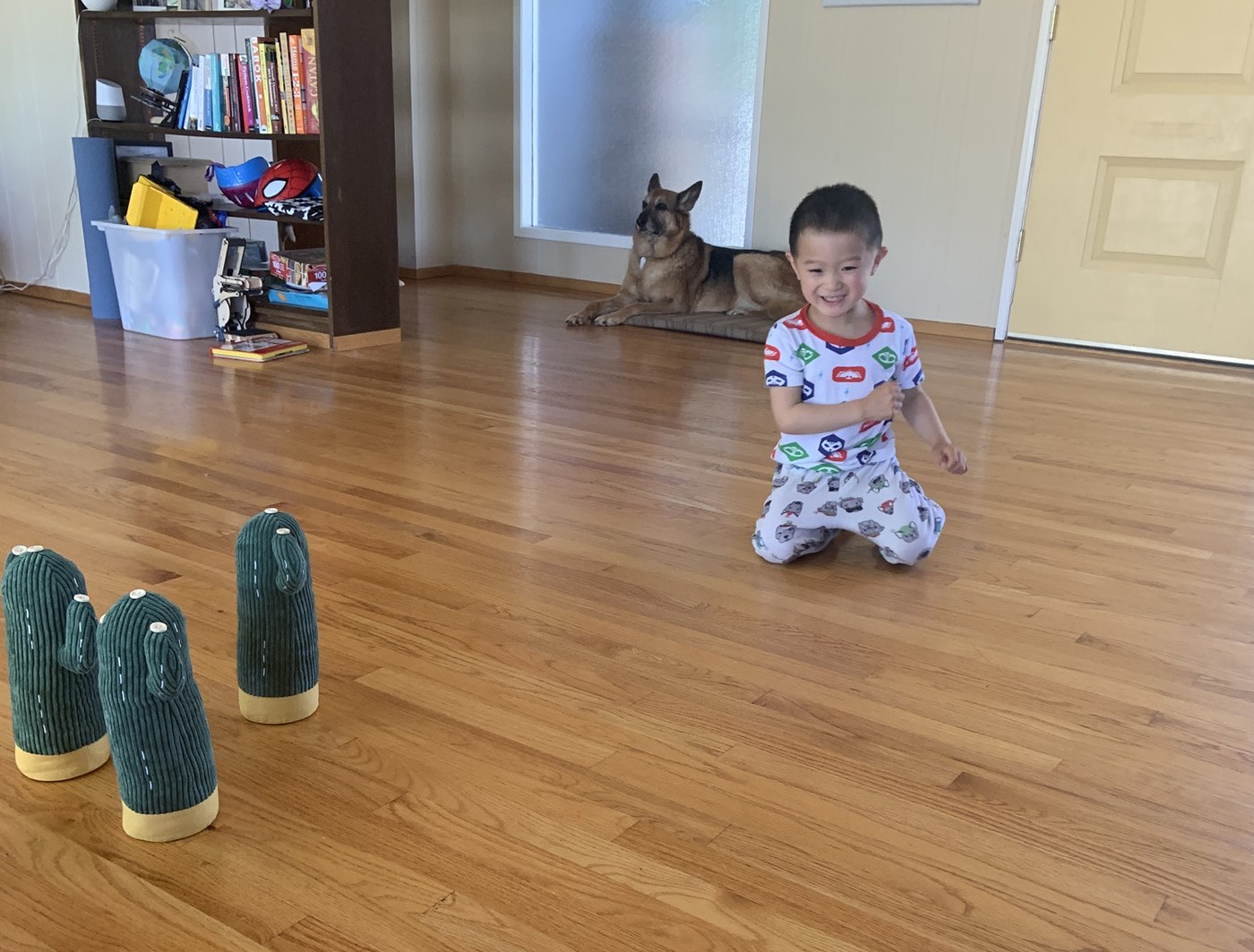
“Can we play again?”
Chloe, kid tester, mid-session
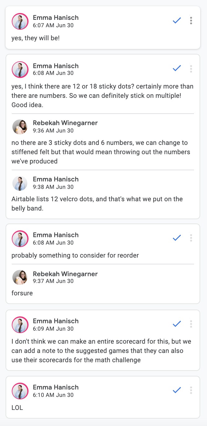
Every session produced written notes, and the notes went straight into a group discussion with product design and editorial. Three changes came out of one session alone:
07 · Atlas Crate
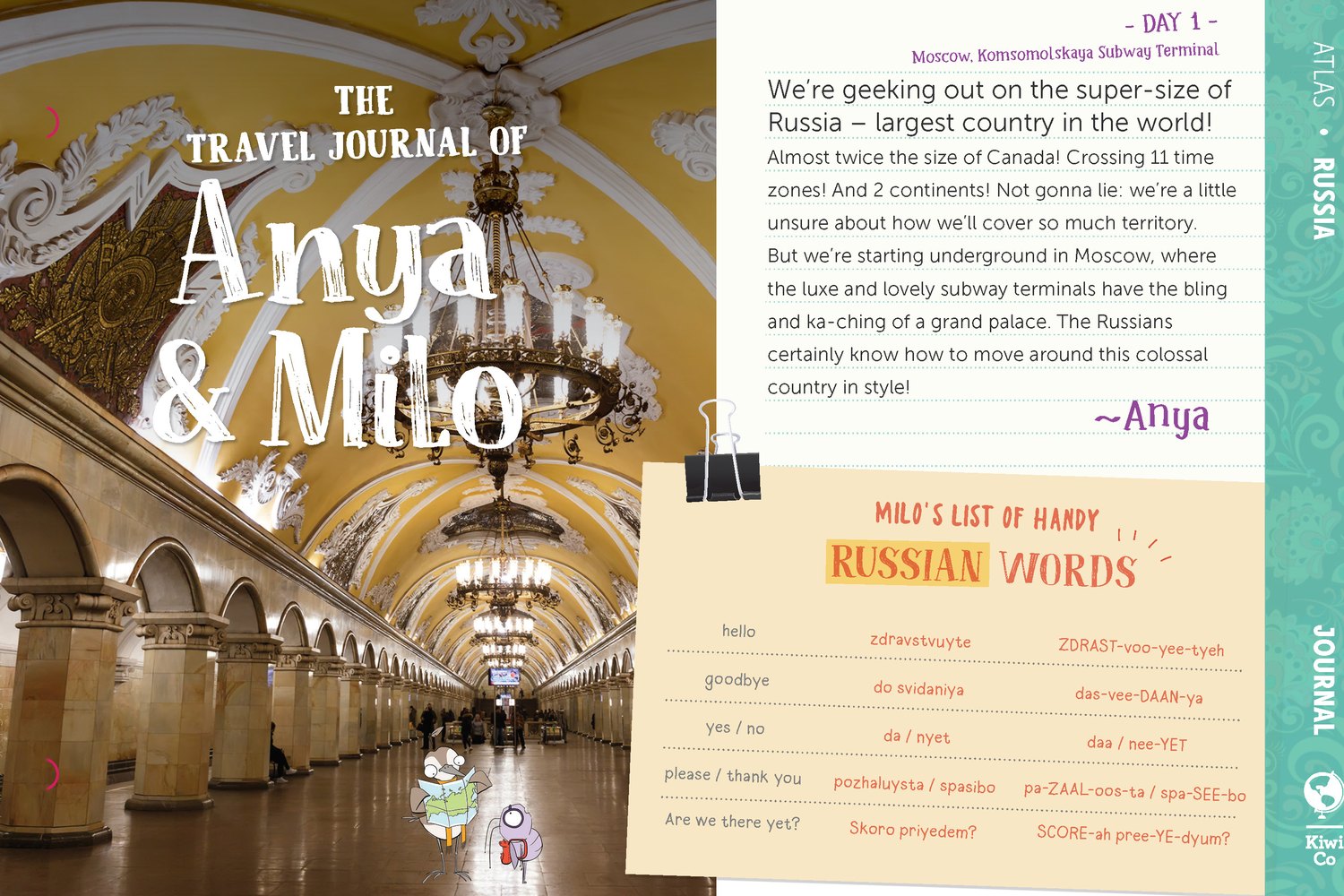
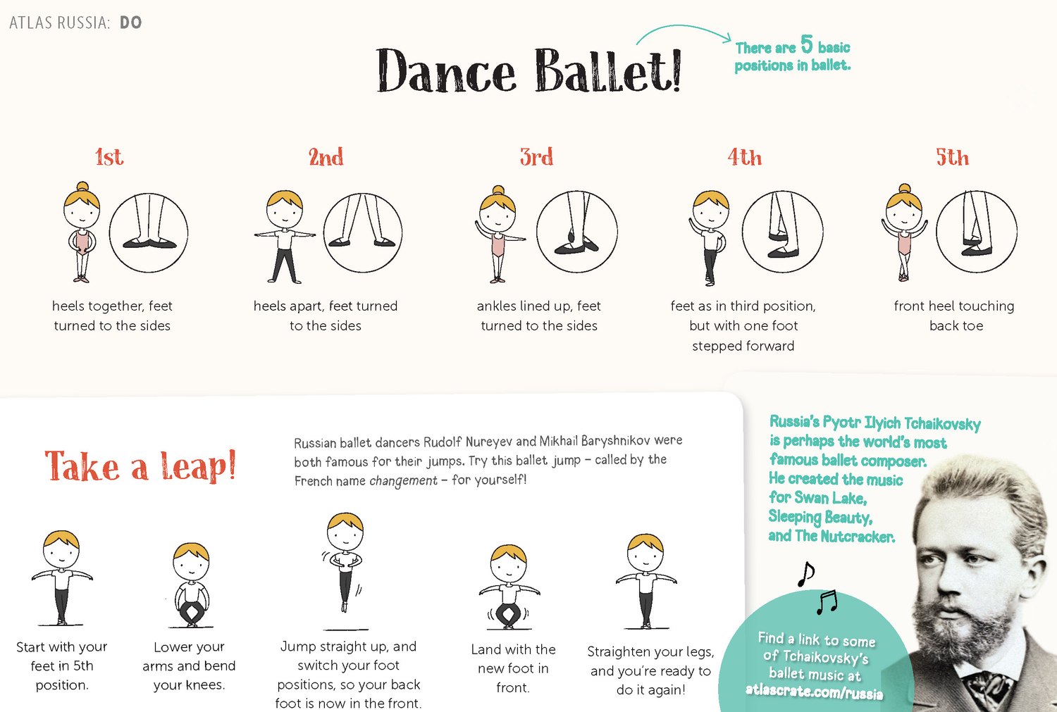
The line I led longest at KiwiCo was Atlas Crate, a world-exploration subscription for ages 6 to 12, still running today. Every month is a country, and every country runs the same five-tab format: Go, Journal, Explore, Do, Eat. Two traveling pen-pal characters, Anya and Milo, narrate the trip; illustrated fact spreads mix drawing with photography; an activity teaches a dance or a craft; a recipe brings the place into the kitchen. I led the line’s graphic and component design across packaging, instructions, and physical components, with country illustration by Carlianne Tipsey and Cathy Wu, shipped monthly and tuned by age line.
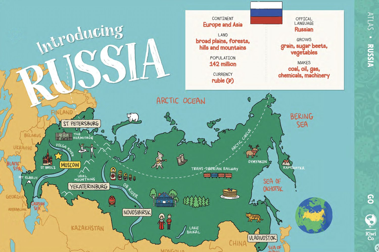
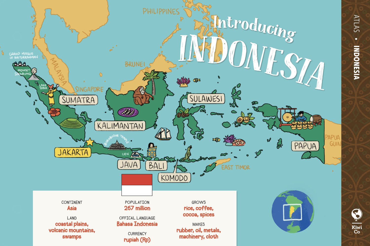
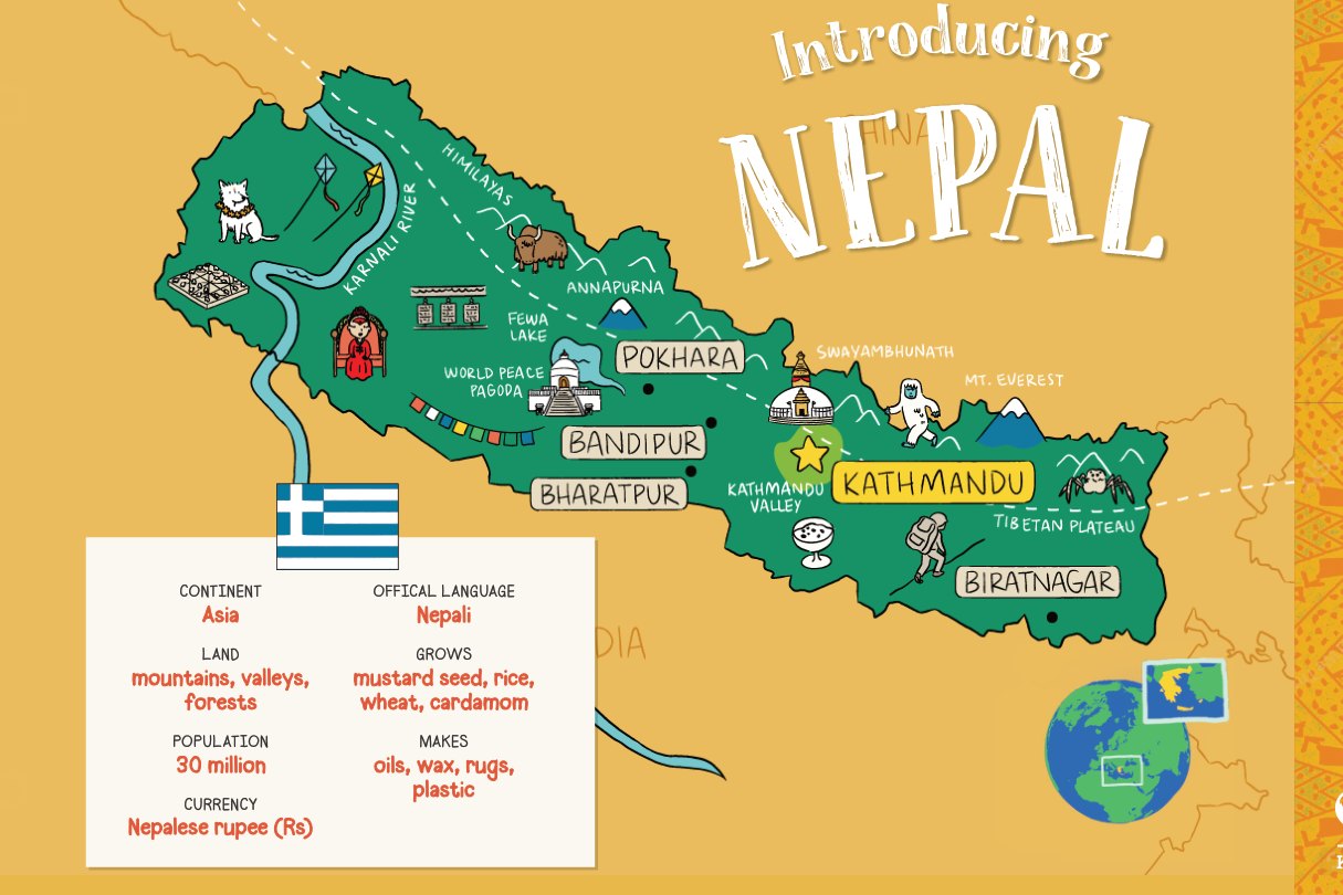
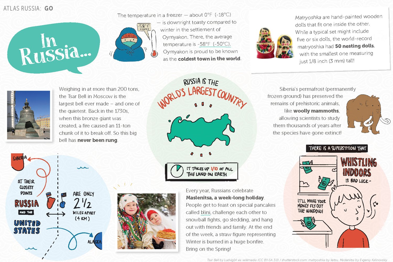
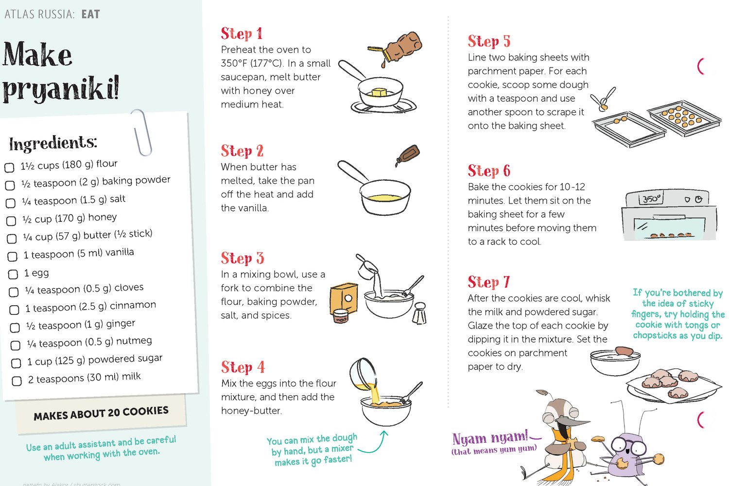
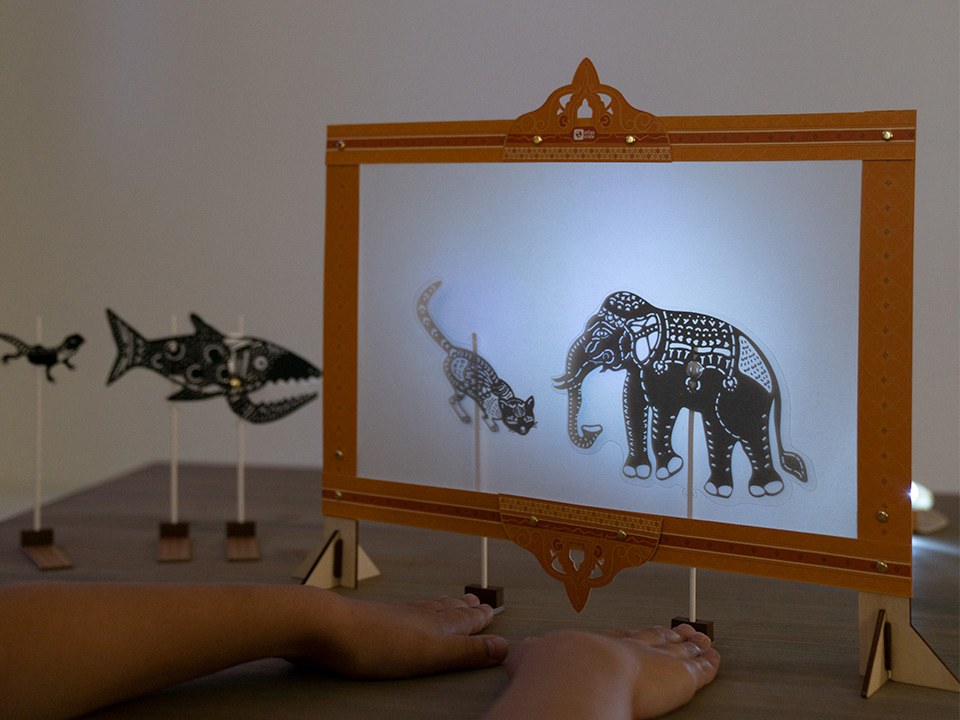
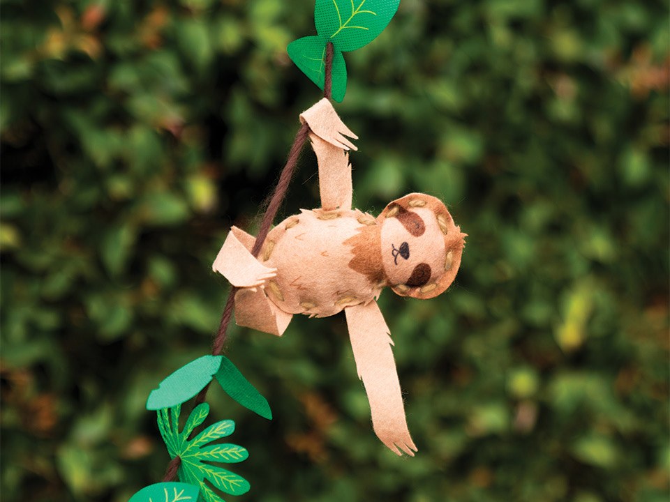
The design instinct underneath is the one I trust most: when the subject is the world, the map is not decoration, it is the navigation. Kids move through the product the way they move through an atlas, one place at a time, and the geography does the wayfinding a menu would otherwise do. That instinct, the world as the way in, still shapes how I design for kids.
08 · Impact
Yummy Crate launched in October 2021 under the campaign line “Snack on science” and grew faster than any line the team had shipped before:
Growth in subscription revenue after launch
Active subscriptions in the first two months
Peak week-over-week subscriber growth
Average rating across 29.9k reviews on kiwico.com
What families said
“We always have so much fun with this box and we get some delicious treats out of it, too!”
Brandi D. · My Subscription Addiction · Dec 2022“I’ve learned A LOT about chemical reactions in cooking that are fascinating!”
Nicolette · HowDoesShe · Dec 2021The full story includes the ending. The launch surge did not hold, and KiwiCo retired the monthly subscription in 2023, about two years after the first crate shipped. Families were still praising the boxes in reviews through the final months, which is its own lesson: a visual system can make a product loved, but it cannot by itself make a business model work.
The numbers above belong to a full team: product design, editorial, illustration, photography, and operations together. My share is the part a family touches first, the look that made a science kit feel like a gift, repeated reliably every month. And the Armadillo Bowling Set is the quiet epilogue: it holds a 4.8★ rating and is still sold on the KiwiCo store today, five years after those living-room tests.
09 · Reflection
This work trained three muscles I still use daily.
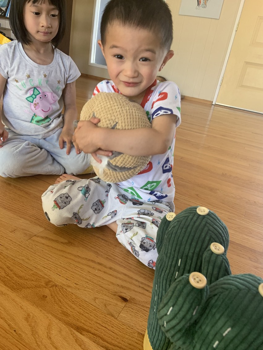
First, the taste line between joyful and juvenile: kids deserve wit, not condescension, and the difference is decided in small choices like a pun on a sticker versus a cartoon on everything. Second, drawing systems other people execute: the monthly format only works because its rules survive contact with a rotating team, which is the same discipline as any style guide. Third, letting kids overrule the team: a six-year-old who can’t read the number on a dark green cactus is a better reviewer than any of us.
The way the line ended taught a fourth. Craft earns love, but it does not guarantee survival, and the redesigns near the end were already trimming pages and recipes to cut costs. Since then I weigh what a design system costs to sustain as seriously as how it looks, because the format a small team can keep producing is the one that lives.
Those muscles became the foundation for the work that followed, a K–5 visual world built to scale across thousands of pages. That story is Takeoff by IXL.