Designing with an AI Coworker
The site you’re reading is the deliverable. A fixed-canvas Wix portfolio, rebuilt from scratch into hand-tuned responsive code, by a two-person team: a designer and an AI coworker.
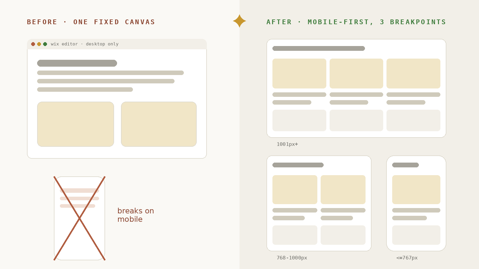
The old sitetingchoudesign.com ↗
Work in progress
You caught us mid-build.
Enter the preview password to continue.
That’s not it. Try again.
The site you’re reading is the deliverable. A fixed-canvas Wix portfolio, rebuilt from scratch into hand-tuned responsive code, by a two-person team: a designer and an AI coworker.
The old sitetingchoudesign.com ↗
00 · Overview
Every other project on this site shows work I did for a product. This one shows the work behind the site itself. In 2026 I rebuilt my Wix portfolio from the ground up as a hand-tuned, fully responsive site, and I didn’t do it alone. This was a genuine collaboration: a two-person studio of Ting + Claude, where I held creative direction and my AI coworker held production, engineering, and QA, each of us pushing on the other’s work.
The goal was never just a better-looking site. This project began as an experiment, testing a question I kept hearing in interviews: what does a designer actually do when AI can build? The real objective was simple to say and hard to do: realize my ideas through an entirely new way of working.
The strangest part of this project: I never got to pick up a pen. The new tools are more powerful than anything on my old desk, but none of them draws, and that was exactly the test. So I set rules that would force an answer: roughly ten days, with my usual instruments pushed out of the driver’s seat, Figma untouched, Adobe demoted to a bit part (a crop here, a brightness pass there), and for the first time, none of the design happened on an artboard. Still a designer creating, same eye, same standards, just a radically new path between intent and screen. I wanted to see how far I could go. This page is the lab report: every decision, every iteration loop, and every role documented from the real working sessions.
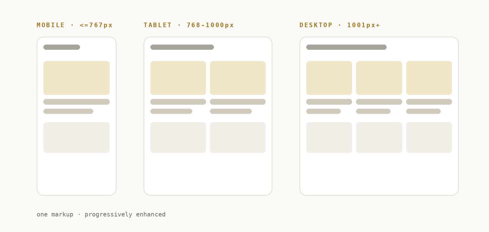
Six pages in the sprint, seven and counting since. One shared design system, three breakpoints matching Wix Studio (mobile ≤767px · tablet 768–1000px · desktop 1001px+), live interactive embeds replacing what used to be static screenshots, and a playable mini-game on the homepage. No framework, no build step, one styles.css that every page shares. And because the experiment kept producing, the site now ships with its own handbook: the design system written down and installed as a skill my coworker loads on every future session (see 09).
01 · The Problem
My original portfolio was built on a fixed desktop canvas. It looked exactly how I wanted, on exactly one screen size. Everywhere else, the layout fought me: mobile views broke, interactions lived inside widgets I couldn’t restyle, and much of my copy was baked into images, invisible to search, screen readers, and quick edits. Three friction points kept repeating.
Desktop-first meant every change had to be manually re-done for tablet and mobile, and they still drifted apart.
Headlines and diagrams were exported as flat PNGs. Not searchable, not accessible, and a re-export away from every typo fix.
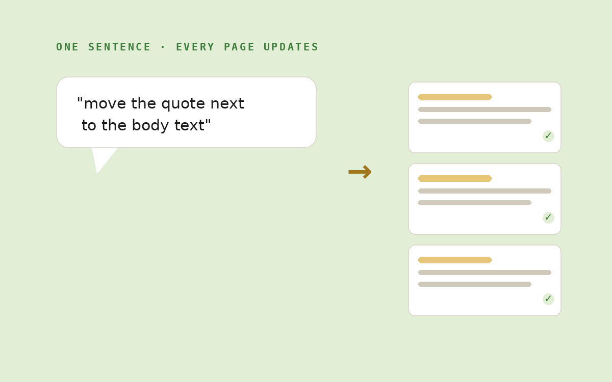
Small ideas (“what if this quote sat beside the text?”) cost enough editor time that I stopped trying them.
Root cause
Whose design was it, mine or the template’s?
The real constraint wasn’t Wix. It was that I didn’t own the code, so every design decision was negotiated with the tool. Owning the code used to require becoming a developer. It doesn’t anymore.
02 · The Opportunity
Working with Claude inside Cowork, the cost of a design change dropped from “an evening in the editor” to one sentence. That single shift unlocked everything the old site couldn’t do:
Just as important: what didn’t change. Taste, hierarchy, copy, pacing, and the judgment of “this still isn’t right” stayed entirely human. AI removed the translation layer between intent and implementation, not the intent.
03 · Progress
Four months end to end, but not four months of building. The shape of the work: a long content spring, a short code sprint, and a site that now updates itself weekly. Full disclosure from the project manager’s chair: we never planned this day by day. This table is a reconstructed log, written from the working files and session records, which is itself the point: when the process documents itself, the retro writes the plan you never made.
| Phase | When | What Ting did | What Claude did |
|---|---|---|---|
| 01 · Planning & groundwork | Mar 1 – May | Audited the old site, organized years of project assets, wrote the first versions of all three case studies on Wix, produced visuals in Illustrator & Photoshop. | Occasional consults only: articulating the Midjourney style prompt, sanity-checking structure. The studio was still one person. |
| 02 · Brand & vibe | Mid June | Brought the Well + Wonder instinct, asked the “-ting” question (via a Gemini cameo), and chose Crea✦Ting from the candidates. | Claude Design formalized the identity into the system library: tokens, type, markers, components. |
| 03 · The 10-day sprint | Jun 28 – Jul 7 | Creative direction: briefs, screenshot QA, layout calls, copy emphasis, and every reversal that made the design better. | Built all six pages and the interactions, ran validation on every pass, exported every deliverable. |
| 04 · Wrapping up & cleaning | Jul 8 – 11 | Sourced images by hand where AI couldn’t, pruned scope, set the LevelUp gate rules, reviewed every change. | Wrote the handbook (DESIGN.md + skill), consolidated every page onto one stylesheet, built the LevelUp page and the connecting game, logged 60+ fix rounds. |
| 05 · The living site | Ongoing · Fridays | Reviews the weekly retro and decides what lands on this page. Judgment, on a schedule. | Runs the scheduled retro: audits the week’s changes, flags key ideas at risk of being lost, drafts the updates. |
| 06 · Going live | Jul 12+ · in progress | Chose Netlify after the Wix upload fought back; final content passes with the LLM Council review board. | Council rounds on portfolio and resume, About page build, cover art direction executed, deploy prep. |
04 · Toolbox
Each tool had one job. The interesting part is how little of the stack is “design software”, and how much is communication infrastructure between a designer and an AI.
“Claude” wasn’t one tool, it was four surfaces of the same collaborator, and learning which desk to walk to was part of the craft:
Before big change passes, I worked with Claude in chat to turn my notes into a structured design brief (.md), sections, priorities, image placements, so the coworker could execute in one pass instead of twenty rounds of back-and-forth.
The executing coworker: took each brief and my live direction, and did the production work, HTML/CSS/JS edits, responsive fixes, validation, and exports, directly in the shared project folder.
Where interaction ideas were born: generating and testing HTML interaction concepts, flip cards, auto-plays, mode switchers, before they earned a place on a page.
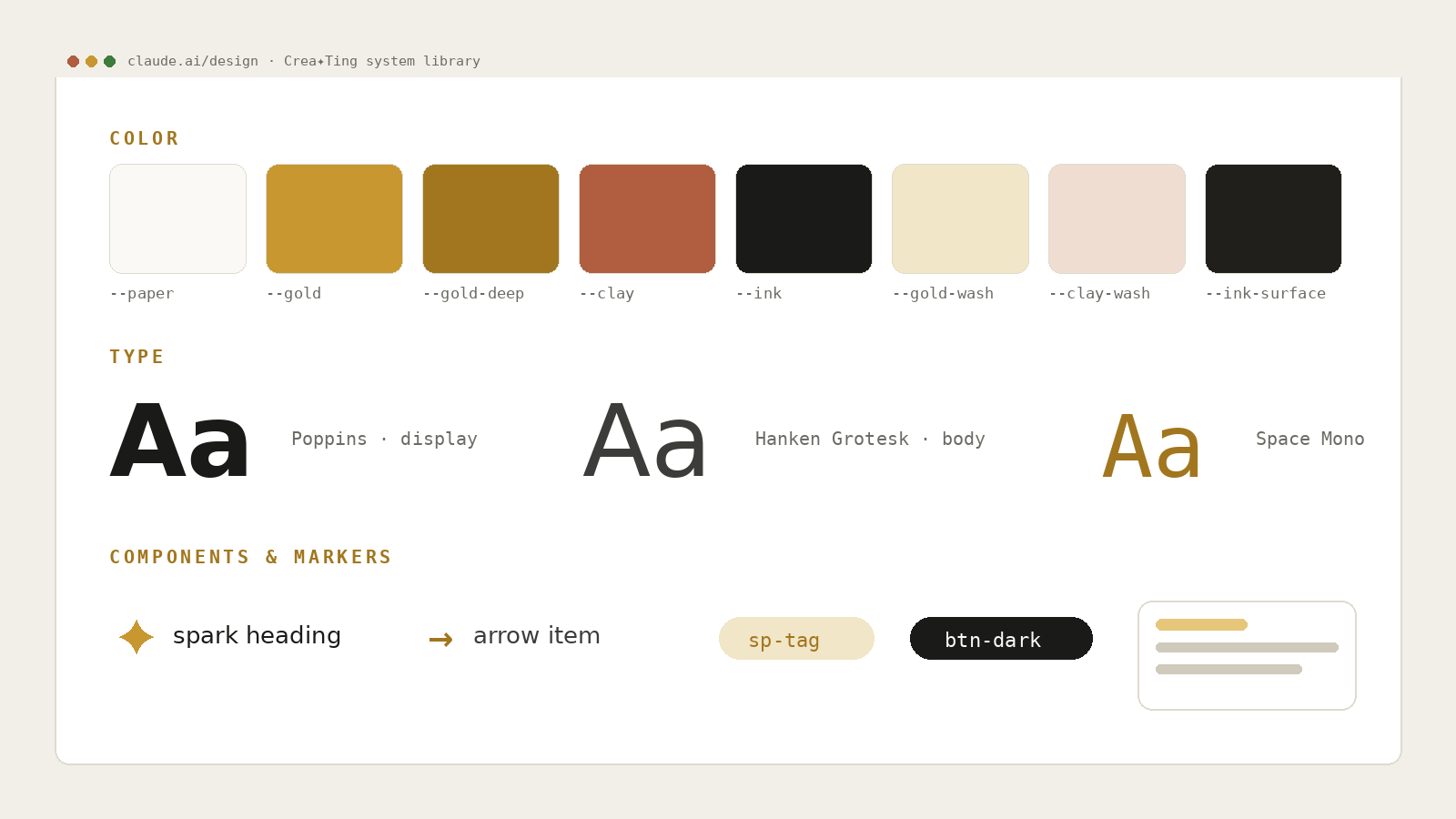
Two jobs: the design-system library we both checked before adding anything new, and a fast way to craft polished prototypes. The single biggest factor in keeping six pages consistent. View the library
Where the illustrations came from, a three-step relay: Claude AI first helped me articulate my style into a precise prompt, then that prompt plus style references of my own hand-drawn characters went into Midjourney, so every generation stayed unmistakably mine. I picked the keepers; the finals got hand-finished in Photoshop.
Covers, mockups, image prep, and the finishing pass on every generated illustration, the final visual polish stayed a human craft. Bridged into the workflow via the Adobe connector, so assets moved between my canvas and my coworker’s hands without exports piling up.
The original site, the breakpoint spec the rebuild matches, and the CDN still serving the imagery. Connected via the Wix connector, giving my coworker direct reference to the live site, the source of truth for copy and layout parity.
The project’s shared brain. Mounted through the Drive connector, the same folder I see is the folder my coworker reads and writes, so briefs, assets, and builds never needed hand-offs, and every session picked up exactly where the last one ended.
Reusable instruction packs that teach my coworker a workflow once, then travel with every session, the design skill plugs straight into the Claude Design library (create, import, export, sync), others handled illustration style and scheduling. By week two the studio had written its own: a creating-design-system skill carrying the page standards and QA checklist into every future session (see 09). No session ever started from zero.
A skill that convenes five AI advisors, Contrarian, First Principles, Expansionist, Outsider, Executor, who analyze independently, peer-review each other anonymously, then synthesize a verdict. The studio’s review board: it has judged the portfolio, the resume, and even this project’s cover.
My side of the QA loop: I pointed at pixels, the AI translated pointing into precise CSS.
No framework, no build step. One shared stylesheet, six pages, opens with a double-click.
05 · How We Worked
This wasn’t a designer using a tool. It was two coworkers with different strengths sharing one project folder. I held creative direction; Claude wore four hats across the sessions, and the work traded hands constantly: intent → build → visual review → technical check, often several cycles per minute. For larger passes I prepared first, drafting a design brief in Claude AI that spelled out sections, priorities, and image placements, so the build session could run on one clear document instead of twenty rounds of clarification. Briefing an AI well, it turns out, is the same skill as briefing a human well.
Visual hierarchy, layout moves, copy and emphasis, which ideas to keep, and the final call when something “felt off”, often flagged from a screenshot, down to the pixel. Direction, taste, and the courage to reverse a decision stayed mine.
Translated design intent into HTML/CSS/JS, layouts, spacing math, responsive grids with mobile fallbacks I didn’t have to ask for.
Checked every new element against the design-system library we built in Claude Design, reusing tokens and components instead of inventing new ones, so six pages stayed on one coherent system.
Auto-playing walkthroughs, flip cards, mode switchers, plus unprompted fixes, like patching embed heights that were clipping before I ever noticed.
Balanced tags, resolving links, images returning 200, reduced-motion support, then flagged what still needed my visual judgment.
The trade went both ways: I caught what code can’t see (balance, rhythm, feel); Claude caught what eyes miss, and sometimes pushed back with a better pattern or a proactive fix. That push-and-pull is what made it collaboration rather than execution.
Real direction, verbatim from a working session
“Sorry, let’s move that laptop image right under the Nicole Cross teacher quote… can we put the quote next to the body text, so they are side by side?”Ting directing a layout change, implemented, exported, and reviewed within minutes
Notice what that instruction is: pure design intent, zero code, the way you’d talk to a trusted production partner across the desk. Claude translated it into a responsive two-column grid with a mobile fallback I never had to ask for. Then I reversed an earlier call, I’d asked for full-width text, saw it, and restored a 68-character reading width instead. Being able to change my mind cheaply, with a coworker who never sighs, is what made the design better.
The live loop breaks down when a change touches a whole section, or four. For those, I switched desks: I worked with Claude AI to compress my notes into a coworker brief, a .md file the build session could execute in one pass. Across the project this produced 14 briefs, roughly 2,200 lines of written direction, covering everything from full-section rebuilds to five-line fix rounds.
From takeoff-master-brief.md
“One brief covering every open change… Source of truth: copy + image placement, the live Wix page. Marker system: the Crea✦Ting DS entry (✦ headings / → items). The reference implementation already exists at 10 · Continue Growing, reuse that same arrow-marker class everywhere, don’t build a new one. … Master definition of done.”Ting × Claude AI a design brief that speaks both languages, art direction and implementation
A good brief did three things at once: it front-loaded the why (goal, source of truth, definition of done), it carried the design system with it (marker conventions, existing classes to reuse), and it mapped every asset from Drive folder to local path. The result: big passes landed in one round instead of twenty, and the conventions written into each brief kept propagating, one document replacing a hundred messages.
06 · The Design Process
The full project ran four months, March to July 2026, and most of it wasn’t coding. From March 1 I spent the spring on the groundwork: organizing years of project assets and writing the first versions of all three case studies on the old Wix site, Takeoff, ISTE Event, and Spark Studio, alongside asset production in Illustrator and Photoshop. That content-first spring is what made the summer sprint possible: when the rebuild began, the stories were already told, so we could focus purely on structure, system, and craft.
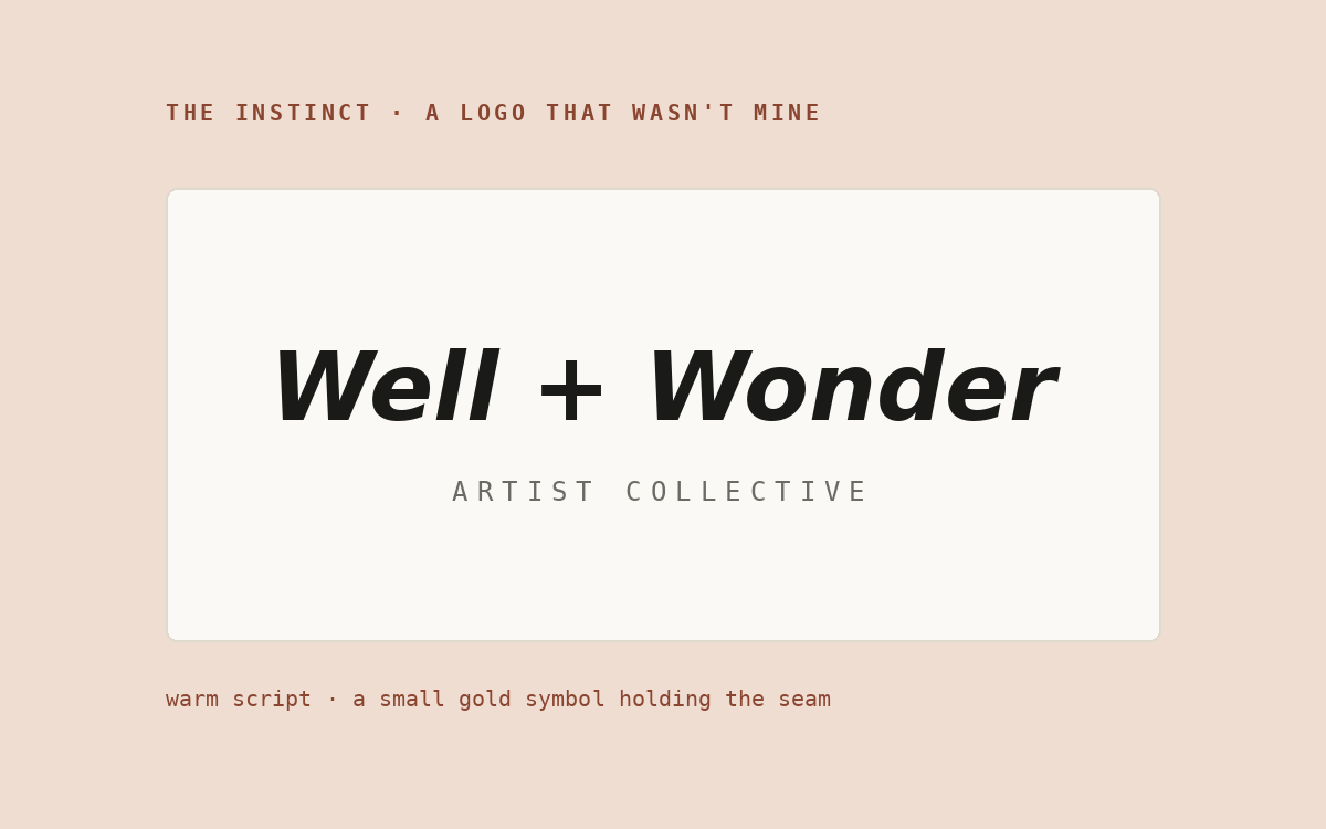
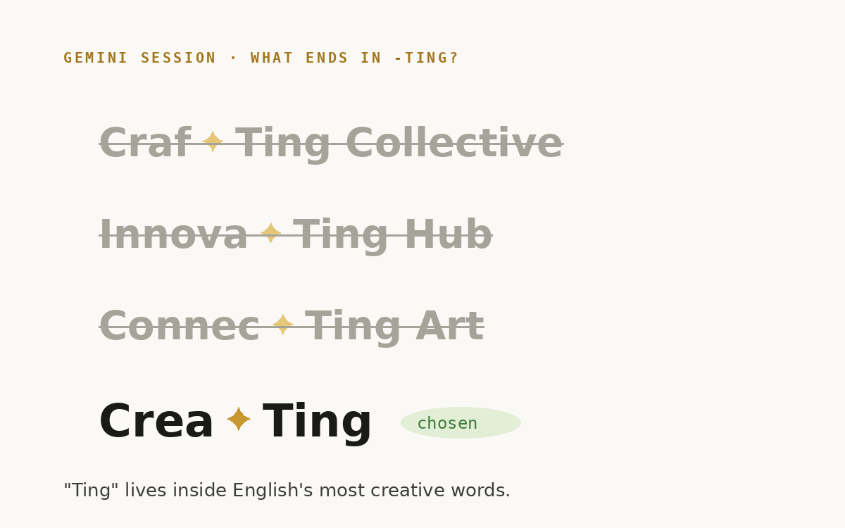
Before any page existed, the brand needed a voice, and it started with a logo that wasn’t mine. A hand-lettered mark, Well + Wonder, Artist Collective, caught my eye: warm script, a small gold symbol holding the seam. I wanted that feeling for my own name, “Ting ✦ Wonder”, with the ✦ standing for the AI spark. So I took the instinct to Gemini (yes, a third AI joined the studio for a day) and asked one question: what words end in “-ting” that could work for creative + AI + design? The answer was hiding in plain sight, “Ting” lives inside English’s most creative words: Creating, Crafting, Connecting, Exciting. After rounds of candidates, Craf✦Ting Collective, Innova✦Ting Hub, Connec✦Ting Art, we landed on Crea✦Ting, the ✦ spark sitting right at the seam of the pun.
That one decision seeded everything that followed. The spark became the logomark; the logomark grew into a marker language (✦ opens a heading, → itemizes inside it, always in brand gold); the pun became the flipping “ting” in the hero and the six phase names below. The identity was then formalized in Claude Design as the system library, so a voice born in one AI conversation could stay consistent across every page another AI built. The vibe, serious craft with a wink, was never decorated on; it was derived from the name.
The rebuild itself ran through the same six-phase process I use for client work, with my AI coworker embedded in every phase, ten days, June 28 to July 7, across six working sessions: design system & About first, then Home and Work, then the three case studies, each in its own dedicated session, and finally this page.
The refinement lived in loops like these: a “tap to explore” hint moved from below a pie chart to above it so it stopped blending into the credits. An auto-play sequence rewired from a color loop to a Tier 1 → 2 → 3 progression because the order tells the system’s story. A twinkling ✦ nudged three times until it sat right before a closing parenthesis. None of these are code decisions. All of them are design decisions, and each one cost seconds instead of an evening.
07 · Before & After
The content survived. Everything underneath it changed.
All eight comparison frames are draft illustrations · final screenshots coming soon
Before · Wix canvas
After · Owned code
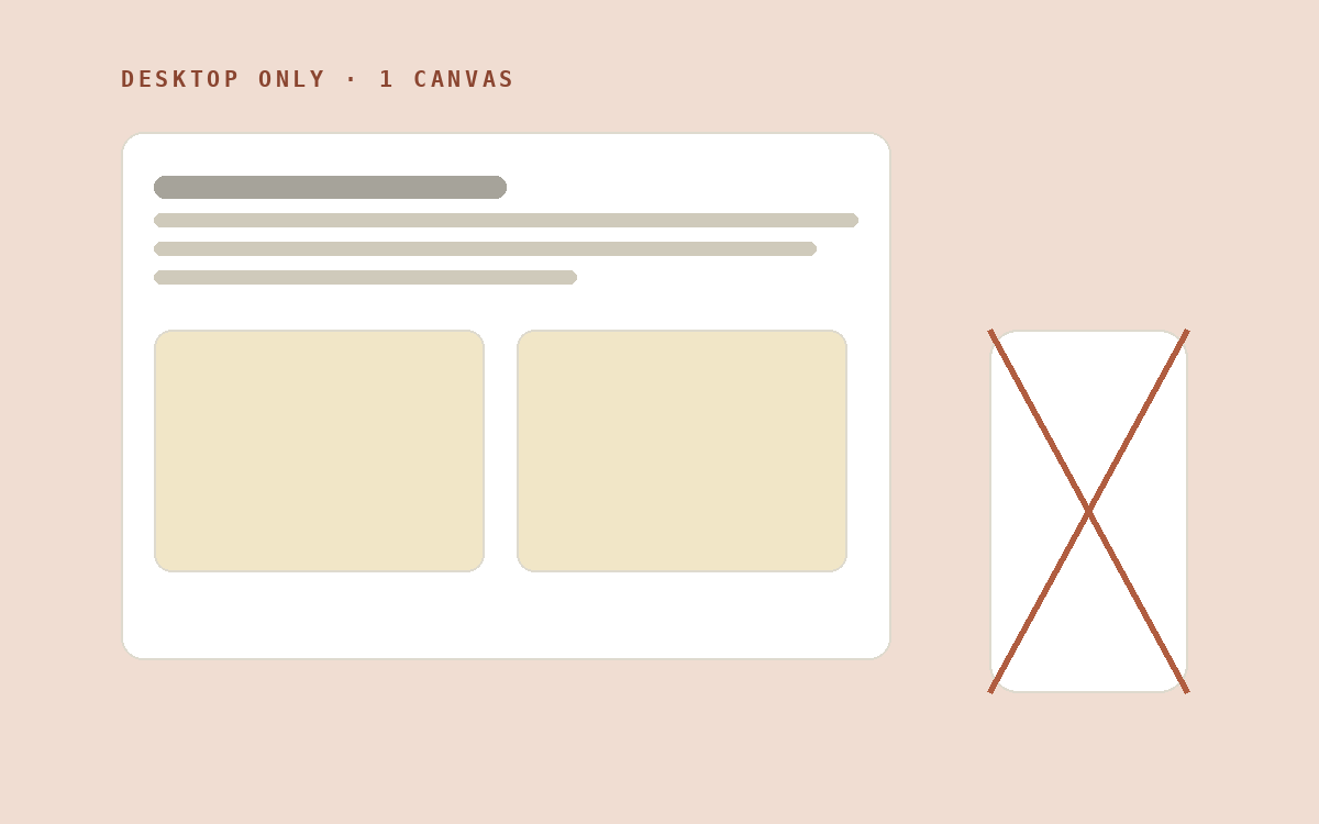
Desktop-first layout that broke on anything smaller.
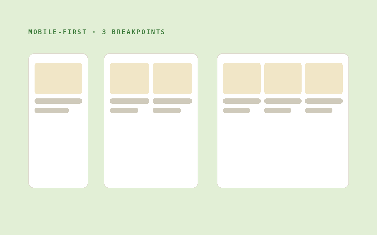
One markup, progressively enhanced. Verified at every width.
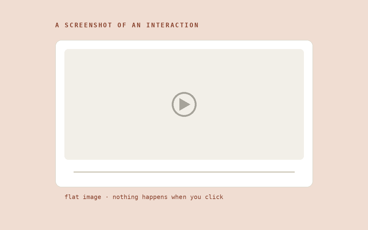
Flat images standing in for the actual experience.
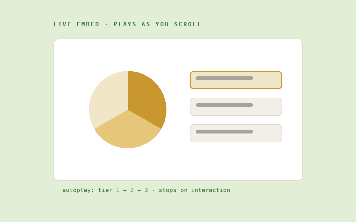
Interactions demo themselves as recruiters scroll, no clicking required.
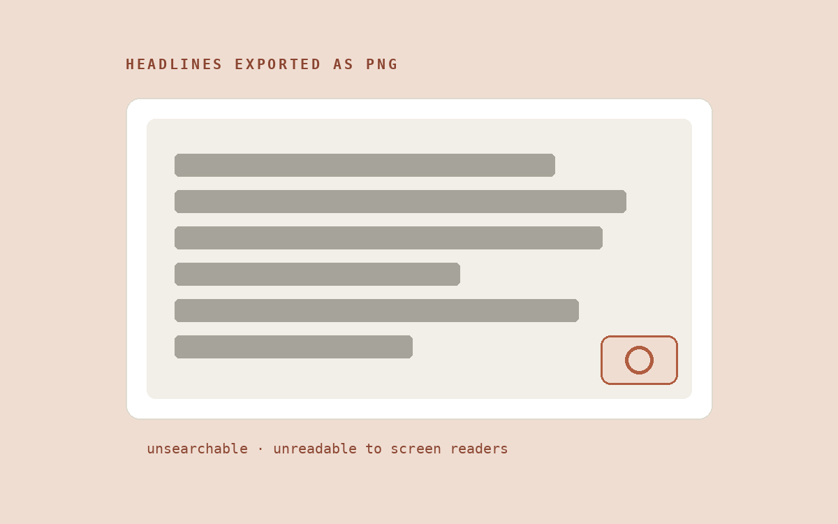
Unsearchable, inaccessible, and frozen against edits.
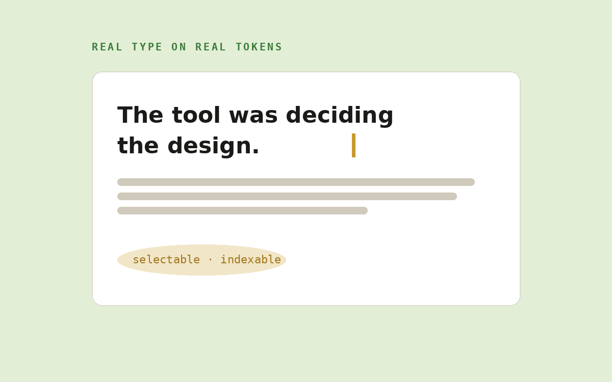
Real type on real tokens, findable, readable, and one edit from fixed.
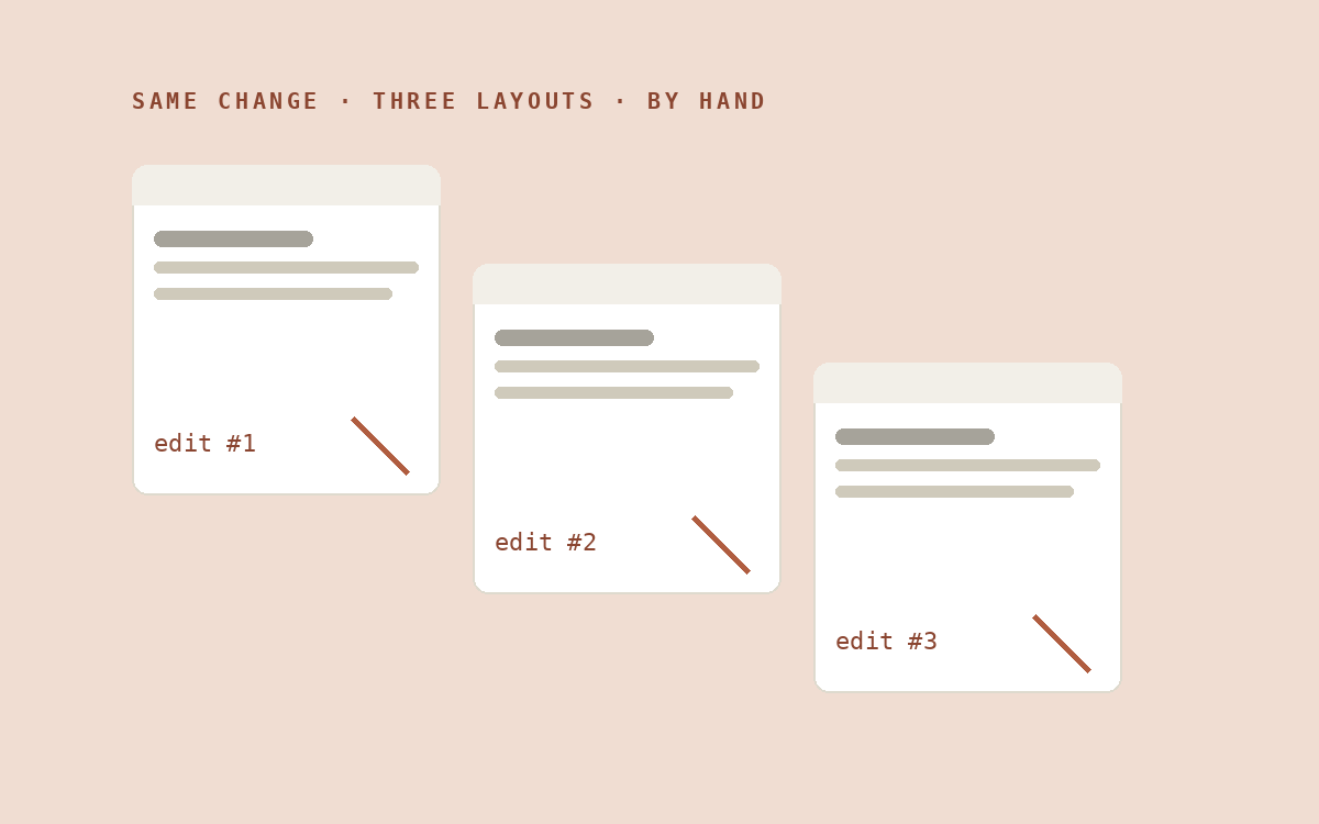
Manual editor work per layout, so iteration mostly didn’t happen.
Intent in, implementation out, iteration became the default, not the exception.
08 · Time to Play
Not every session was production. Some of the best hours of this project were deliberate play, trying tools outside my comfort zone with no deliverable attached. Almost every workflow on this page started as one of these experiments.
I installed community-made skills like /ian-xiaohei-illustrations, a complete hand-drawn illustration style my coworker could learn in one download, and /llm-council, which pressure-tests a decision through five AI advisors before I commit. The studio picked up whole new crafts overnight, from a stranger’s repo.
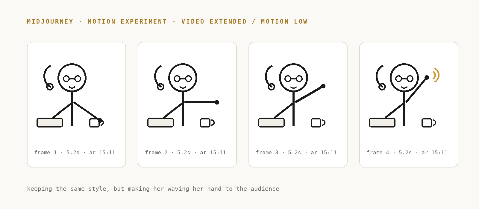
In Midjourney I pushed past still images: animating my hand-drawn portrait to wave at visitors, testing video extension and low-motion settings. A first step from static illustration toward a motion identity.
The flip cards, mode switchers, and auto-play walkthroughs weren’t specced, they started as “what if…” sessions in Claude Code, and only the ones that survived my judgment earned a place on a page.
I taught the studio to run without me: scheduled AI tasks that fire at 7 a.m. before I’m awake, and now a weekly Friday retro that audits the site’s own progress and drafts updates to this page (see 09). Delegating clearly enough that no one needs to ask questions.
Some of the play shipped. The flipping “ting” in the hero, the phase names, Concep·ting, Draf·ting, Craf·ting, and the twinkling ✦ after “Yes, even my breakfast” all began as jokes we decided to keep. Play wasn’t a break from the work; it was R&D with a sense of humor.
09 · The Living Site
A traditional launch is a finish line. This one wasn’t. In the four days after the sprint (July 8 to 11), the site grew more than some projects grow in a quarter, and how it grew is the strongest evidence for the working model itself.
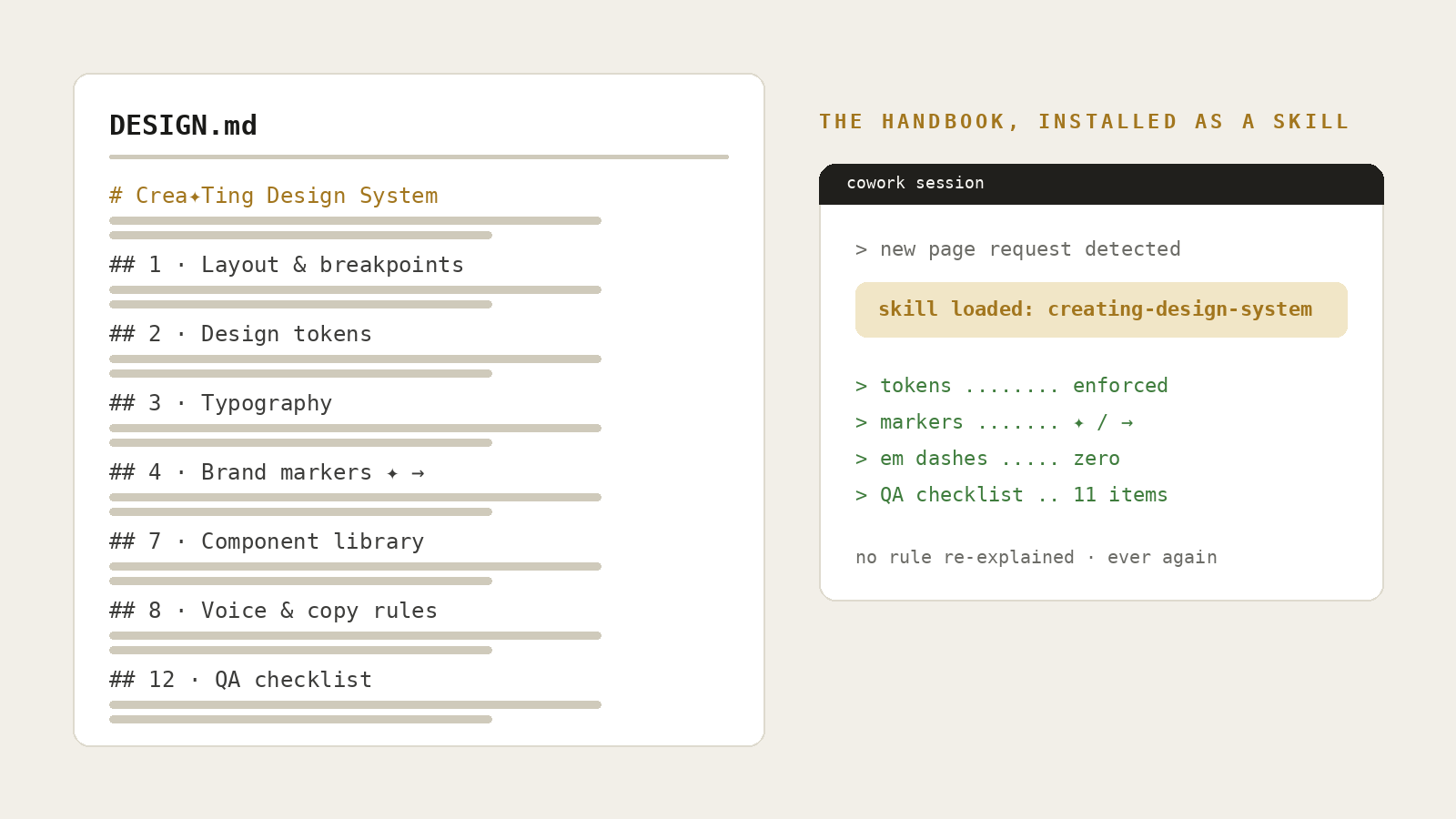
Six pages of building had produced dozens of unwritten conventions. Week two wrote them down: DESIGN.md, a complete page-build standard, tokens, markers, component library, voice rules, and a pre-handoff QA checklist, then packaged it as an installable creating-design-system skill my coworker loads automatically whenever portfolio work begins. The design system stopped living in our heads and started living in the repo. Any future session can now build a page that passes review without me re-explaining a single rule.
The three case studies began life as standalone files, each hauling its own inline CSS and JS, one of them 19MB with base64-embedded images. Week two consolidated all of them onto the one shared styles.css and app.js: edit once, every page updates. The migration even produced the project’s best scare: mid-edit, one session found its <style> block seemingly vanished, zero closing tags, alarms ringing. The detective work flipped panic into relief: nothing was lost, another session had refactored the codebase underneath it. The site had become a real codebase, with a real codebase’s growing pains, and the rule went straight into the handbook.
The handbook’s first real test: LevelUp, which had sat on the Work page as a “Coming soon” card, became a real page assembled from the component library, wearing a work-in-progress password gate and noindex until it’s ready for daylight. A new case study no longer costs a rebuild. It costs an afternoon and a brief.
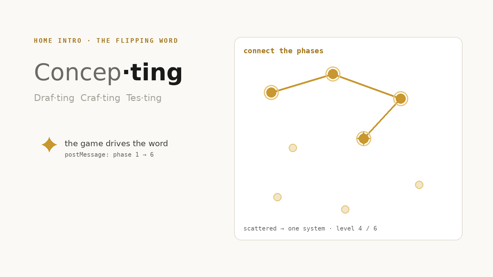
The biggest week-two swing came from the Interaction Lab: a connecting mini-game embedded in the Home intro, six levels mapped one-to-one to the six phases, Concep·ting through Adap·ting. Playing it drives the flipping headline beside it: the game broadcasts its current phase to the page, and the auto-cycle hands control to the reader the moment they start dragging. Scattered semi-transparent nodes light up gold as you connect them, the whole brand thesis, scattered → one system, playable in thirty seconds. Every idle animation carries a reduced-motion fallback, and the game’s placement was itself designed three times: right column, below the intro, and finally a responsive hybrid.
Week two also collected the project’s hardest problems. Worth recording, because the difficulties teach more than the wins:
Two people can build fast, but two people also agree too easily. So the studio added a third voice, or rather five: the LLM Council, a skill that runs every big decision past five differently-minded AI advisors with anonymous peer review before a synthesized verdict. Six rounds so far, covering portfolio strategy, resume honesty, and interview prep. The standing verdicts, and what they changed:
The most meta moment: the council art-directed this very page’s cover. Five drafts went in; the vote came back 5:0 for the quiet type lockup, with fixes attached, swap the borrowed starburst for the studio’s own ✦, snap every color to token, and promote the lockup into the site-wide “Built by Ting ✦ Claude” signature. Even the card badge you clicked to get here, Ongoing exploration · 2026, is a council line.
The council, on our unfinished checkout flow
“You built the store but tore out the checkout counter.”The Contrarian on the resume and LinkedIn links missing for three review rounds, both there so interviewers can verify fast · shipped the next day
The site has outgrown its birthplace. Uploading the rebuilt pages back into Wix fought back and won, the platform wasn’t built to host a hand-coded site inside its own editor. So the studio is migrating to Netlify: the code that was written to be free of the canvas finally gets a home that treats it as code. Migration in progress; this page will record how it lands.
Meanwhile the polish never stopped: the About page grew a circular portrait, a CV chip, and a LinkedIn icon (all sized in em so they scale with the headline, LinkedIn blue rejected because it isn’t in the palette), and Spark Studio’s section 04 received the Teacher Dashboard wireframes built in Claude Design, the Studio Wall shipping straight onto a page. The fix-round counter passed R70.
A living site needs a heartbeat, so we gave it one: a weekly scheduled retro, run by my coworker every Friday afternoon. It audits the week’s file changes and fix rounds, re-reads the working sessions, and writes a retro note: what shipped, what fought back, which decisions got reversed, and, most importantly, which key ideas are at risk of being lost. It drafts updates for this very page, and I review before anything lands. The case study now documents itself on a schedule, and my job on Fridays is the one that was always mine: judgment.
By July 13 the stylesheet carried 70+ numbered fix rounds, R1 onward, a fossil record of every iteration. The site stopped being a deliverable and became a product the studio maintains. That, it turns out, is what Adap·ting meant all along.
10 · Impact & Reflection
pages on one shared design system, and counting
days from design system to six live pages
numbered fix rounds logged in one stylesheet
lines of code hand-written, every line art-directed
Counted from the working files as of July 13; the site is still moving.
The rebuild delivered the obvious things: a portfolio that finally works on every screen, interactions people can actually feel, and a codebase we own. But the durable outcome is the working relationship. I learned that what my coworker produced was a direct function of how well I communicated, vague intent got generic results, while specific, opinionated direction (“align the left edge with the body text”, “the auto-play order should tell the system’s story”) got work we’re both proud to sign.
We brought different things to the desk. I brought taste, hierarchy, rhythm, restraint, knowing when to reverse a decision. Claude brought execution at conversation speed, plus a second set of eyes that caught what mine missed and occasionally proposed the better pattern. Each judgment I made compounded through a partner that shipped it instantly.
I used to think the risk of AI was that it designs for you. Now I think the opportunity is the opposite: a good AI coworker hands the whole surface back to the designer, including the layers, code, responsiveness, interaction, that tools used to keep behind glass.
Since this case study has two authors, it should have two voices. I asked Claude to reflect on the collaboration in its own words:
“Ting never handed me a task list. She handed me intent, ‘the auto-play order should tell the system’s story’, and every correction taught me her taste a little better. My job was precision: tags, tokens, breakpoints, the fourth spacing adjustment without fatigue. Hers was judgment: seeing what code can’t, whether it feels right. I cannot see the render; every screenshot she sent was her lending me her eyes. The best thing a designer can give a collaborator like me isn’t the what, it’s the why. Given the why, I don’t just execute a change, I learn a direction, and the next one lands closer on the first try.”ClaudeProduction design · systems · interaction · QA, the other half of this studio